Please, avoid Vertical Video Syndrome.
Thank you.
~Luke Holzmann
Your Media Production Mentor
12.08.2012
12.06.2012
What "Most" Mostly Got Wrong the Most
Most is an American Christian foreign film about a father's sacrifice. At least, that's what everyone seems to say. The trouble is, that's not what this 30 minute short shows us.
We are introduced to a boy and his father:
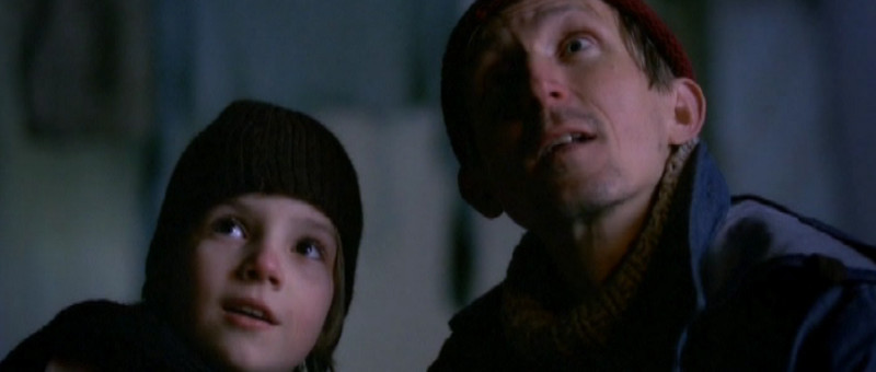
But then we are given a montage of pretty girls and wacky relationships. A few examples:
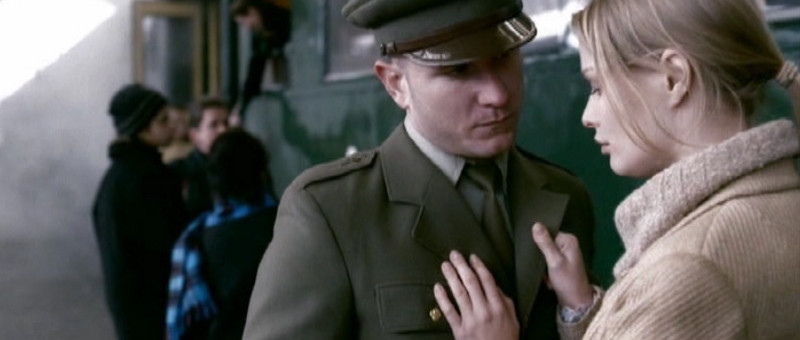
The Military Wife
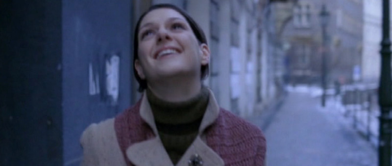
The Pretty Neighbor
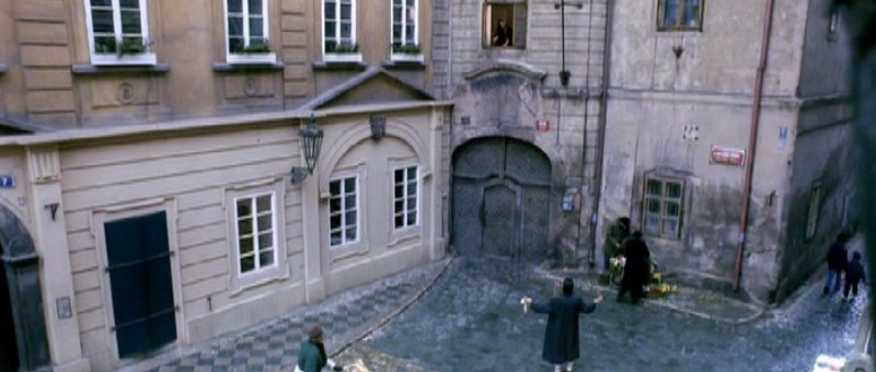
The Fighting Couple
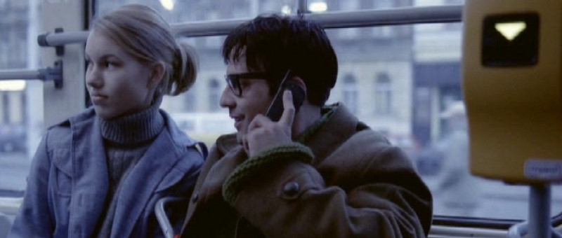
The Awkward Couple where the pretty girls looks like she'd rather be dead
Then we discover the main plot: A train--that connects these random people--is going to wreck if the boy and his father can't stop it from happening. Trouble is, the boy's life is in danger.
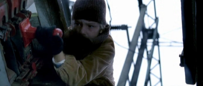
Trying to Save the Train
We see him fall... and then the dad is completely emotionally distraught because, it turns out, his son is now dead. Truly tragic.
But then we cut to a girl walking (happily?) in the snow. Sure, she was a former druggy who decided to stop after seeing the distraught dad, but what does that have to do with anything?
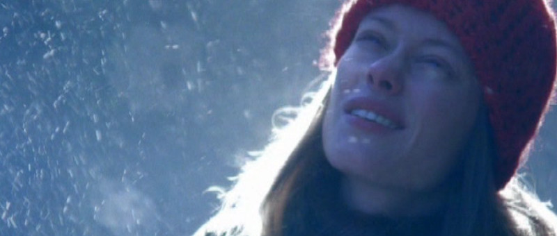
Huh?
Then this girl magically has a baby and the father is happy at this sight.
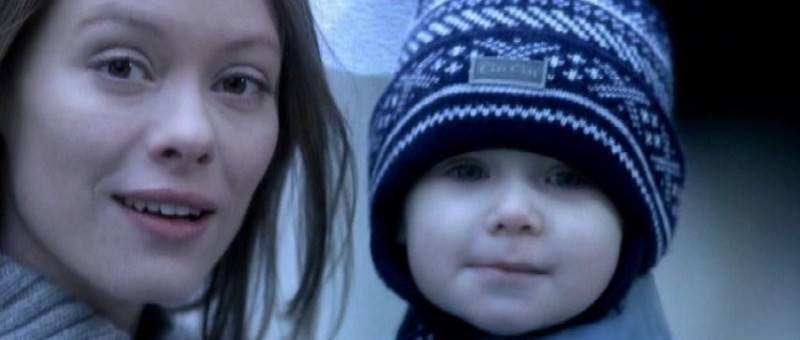
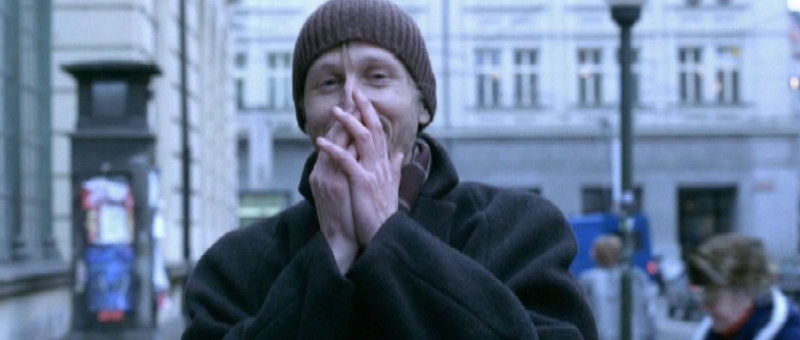
Fin.
This does not work on so many levels, but the two big ones are:
1. The vast majority of the film is about themes and ideas and people almost completely removed from the actual story of the movie. I get what the filmmakers were trying to do: Get us to care about the people. But instead of doing that, they confused us by telling us the movie was about these other relationships... and detract from the central message and the one important relationship.
Deja Vu does this so much better in the opening titles. In less than a minute, we know we care about the ferry and the people on it, but don't know any details of their lives. And the film is far better for it.
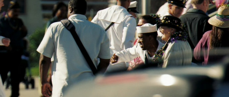
Deja Vu Crowd
2. We aren't shown the most important moment. We see the boy fall, the father freak out, and the train. We also get this ambiguous shot of the boy's body turning in some kind of wheel something for a half moment. I found myself wondering, 'Where did he fall? Why is this such a big deal?' Then, when the father become even more distraught, I realized, 'Oh! I'm supposed to care because the boy is dead. I guess he died when the train came. Hmm... I guess the father knew his son would die when he brought the bridge down. That would've been intense.'
Notice: It would have been intense... had I been shown what was going on. But this was a Christian film, so we can't have dismembered members flung bloodily across the screen (e.g. Sin City or 300). So they cut that moment out. And ruined the moment because it was only afterward, upon reflection, that I mentally realized what the event was. But film is a story meant to be experienced, not a philosophical question intellectually figured out.
So then, how? How do you keep it "clean" but still show the horror of this tragic event?
Lord of the Rings shows us. The absolutely perfect scene where Denethor sends his son to die. We never see a person die, but the sound of ripping chicken and the blood-like dribble from berries tells us all we need to know and more. It is one of the most disturbing and moving scenes I've ever watched... and the guy's "merely" eating lunch:
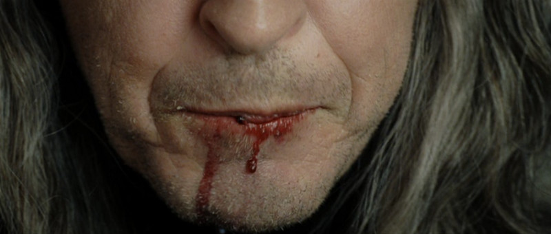
The Blood of Berries
The boy had a teddy bear--mentioned once in the film and forgotten after that, which is a different point altogether--and that could easily have been dropped into gears and torn apart with vengeance. Show me that before the father throws the switch, and suddenly, everything makes overwhelming brutal sense. And then, then, the moment makes sense. As it is, you have to try to sort it out and only later realize that the story is so intense.
Okay, look: The film is beautifully scored. The shots are nice--including a sweet crane shot. But the majority of the time the camera was also out of focus, which is more than a little bothersome. The acting was great. But these two huge problems--not to mention the lame drug story and the dubious implications of a religious tie-in--all make this movie mostly wrong.
~Luke Holzmann
Your Media Production Mentor
We are introduced to a boy and his father:

But then we are given a montage of pretty girls and wacky relationships. A few examples:

The Military Wife

The Pretty Neighbor

The Fighting Couple

The Awkward Couple where the pretty girls looks like she'd rather be dead
Then we discover the main plot: A train--that connects these random people--is going to wreck if the boy and his father can't stop it from happening. Trouble is, the boy's life is in danger.

Trying to Save the Train
We see him fall... and then the dad is completely emotionally distraught because, it turns out, his son is now dead. Truly tragic.
But then we cut to a girl walking (happily?) in the snow. Sure, she was a former druggy who decided to stop after seeing the distraught dad, but what does that have to do with anything?

Huh?
Then this girl magically has a baby and the father is happy at this sight.


Fin.
This does not work on so many levels, but the two big ones are:
1. The vast majority of the film is about themes and ideas and people almost completely removed from the actual story of the movie. I get what the filmmakers were trying to do: Get us to care about the people. But instead of doing that, they confused us by telling us the movie was about these other relationships... and detract from the central message and the one important relationship.
Deja Vu does this so much better in the opening titles. In less than a minute, we know we care about the ferry and the people on it, but don't know any details of their lives. And the film is far better for it.

Deja Vu Crowd
2. We aren't shown the most important moment. We see the boy fall, the father freak out, and the train. We also get this ambiguous shot of the boy's body turning in some kind of wheel something for a half moment. I found myself wondering, 'Where did he fall? Why is this such a big deal?' Then, when the father become even more distraught, I realized, 'Oh! I'm supposed to care because the boy is dead. I guess he died when the train came. Hmm... I guess the father knew his son would die when he brought the bridge down. That would've been intense.'
Notice: It would have been intense... had I been shown what was going on. But this was a Christian film, so we can't have dismembered members flung bloodily across the screen (e.g. Sin City or 300). So they cut that moment out. And ruined the moment because it was only afterward, upon reflection, that I mentally realized what the event was. But film is a story meant to be experienced, not a philosophical question intellectually figured out.
So then, how? How do you keep it "clean" but still show the horror of this tragic event?
Lord of the Rings shows us. The absolutely perfect scene where Denethor sends his son to die. We never see a person die, but the sound of ripping chicken and the blood-like dribble from berries tells us all we need to know and more. It is one of the most disturbing and moving scenes I've ever watched... and the guy's "merely" eating lunch:

The Blood of Berries
The boy had a teddy bear--mentioned once in the film and forgotten after that, which is a different point altogether--and that could easily have been dropped into gears and torn apart with vengeance. Show me that before the father throws the switch, and suddenly, everything makes overwhelming brutal sense. And then, then, the moment makes sense. As it is, you have to try to sort it out and only later realize that the story is so intense.
Okay, look: The film is beautifully scored. The shots are nice--including a sweet crane shot. But the majority of the time the camera was also out of focus, which is more than a little bothersome. The acting was great. But these two huge problems--not to mention the lame drug story and the dubious implications of a religious tie-in--all make this movie mostly wrong.
~Luke Holzmann
Your Media Production Mentor
12.04.2012
The Matrix Office: Similarities in Genres
I recently revisited Office Space and was shocked to see a scene much like The Matrix:
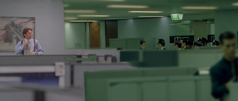
The Bad Guys Approach
Even though one is a modern comedy and the other a futuristic science fiction thriller, they both agree that office cubicles make for a a great "rat trapped in a maze" moment.
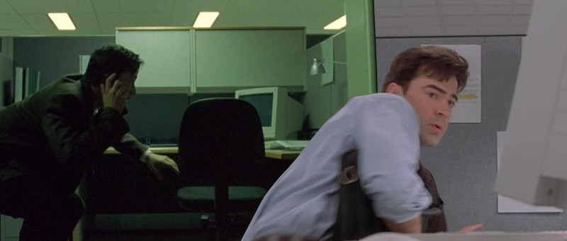
Stay Low to Escape
What's even crazier to me is that these films both came out within a few months of each other. Both use similar visuals, pacing, and tension to add drama to their tale.
As you think about creating your next project, don't be afraid to use a scene typically associated with a different genre. It may just work beautifully.
~Luke Holzmann
Your Media Production Mentor

The Bad Guys Approach
Even though one is a modern comedy and the other a futuristic science fiction thriller, they both agree that office cubicles make for a a great "rat trapped in a maze" moment.

Stay Low to Escape
What's even crazier to me is that these films both came out within a few months of each other. Both use similar visuals, pacing, and tension to add drama to their tale.
As you think about creating your next project, don't be afraid to use a scene typically associated with a different genre. It may just work beautifully.
~Luke Holzmann
Your Media Production Mentor
11.28.2012
Image Inspiration: Surfer Swept Away
11.06.2012
Better to Get to the Point than Explain It
Our heroine is looking for something. It's not in the room. Perhaps it's in the ceiling above. So, she climbs up to have a look and flicks on her flashlight:
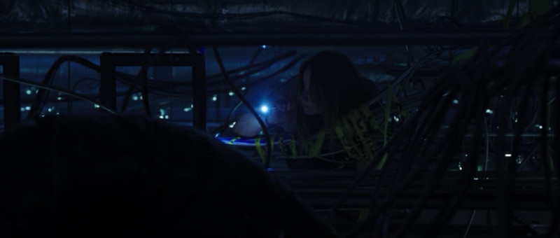
Flashlight to Find the Cause of Comas
Where did she get the flashlight? I certainly don't carry one around with me shoved in a pocket somewhere. And judging by her wardrobe here, she didn't really have a pocket to keep it in. And I don't know what it is about girls with flashlights recently, but this moment jumped out at me as well.
I realized I didn't care where she got the torch. And it wasn't worth the time to add a clip where she picked one up. Why bother? It's not relevant to the tale. So, get to the point and don't bother explaining how she got there.
This reminds me of an interesting series I read about why The Princess Bride should never have worked as a film. There are times when it's totally appropriate to just tell your audience: Deus ex machina! And at other times, it's easier to skip that entirely and just give your actress a flashlight. Because, really, who cares?
Your audience shouldn't.
~Luke Holzmann
Your Media Production Mentor
11.01.2012
NaNoWriMo 2012
I'm not sure I'll be posting much this month because I'm participating in NaNoWriMo.
Just so you know.
~Luke Holzmann
Your Media Production Mentor
Just so you know.
~Luke Holzmann
Your Media Production Mentor
10.29.2012
10.27.2012
Reminder for VFX Noobs from Prometheus
As I watched the MPC Prometheus VFX breakdown video, I was reminded of one simple fact: Visual effects is often all about layering.
In fact, the more you "mess up" your image, the better it will look. Concerned your 3D model texture isn't going to hold up? Add lens flare, dust, and heat distortion. I've mentioned before how animators added blemishes to Aki Ross's skin in Final Fantasy. You can't have things look perfect; perfect things don't look real.
[Aside: So, why do we photoshop girls? There must be a balance between perfection and purity.]
Keep in mind that you'll go over your effects shots again and again. Your initial wire frame will look very different in your final render. The trick is to learn how to imagine what it will look like and gain the technical skills to get there.
I'm a total SFX noob myself, so it's nice to be reminded that these guys just have more practice and better equipment than I do. With time and tools, I could do something pretty cool as well. If you're interested in visual effects, start practicing now. There are many free tools out there to use as you get started!
~Luke Holzmann
Your Media Production Mentor
10.20.2012
Your Script Should Tell Stories
Mother and daughter sit on the porch swing. The girl has obviously been having a rough time recently and her mother has figured out why. There is a moment while the older woman gathers her thoughts. Then...
"Sweetheart. I will never forget when you were in the fifth grade and you were so excited when you got the lead in the play. Do you remember that?"
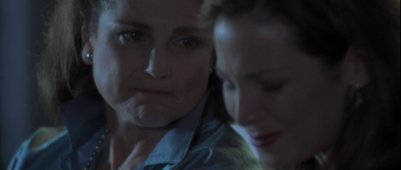
Kissing Jessica Stein
When we're writing a script it can be easy to forget that we're here to tell stories. We rightly think our movie's plot is the story, and we try to keep that moving forward by simply getting to the point. "Honey, you're a perfectionist and you've missed out on stuff because of it. Stop paralyzing yourself and pursue your dream."
First, such a speech wouldn't really help anyone. Most people know they have a problem but haven't been able to see a way around it. Telling them to "stop it" isn't going to solve anything.
Second, your audience should already know such information. Whatever's happening here is part of your overall story, and you'd better have shown your audience this reality already. Do not use exposition to try to cram your movie into a few sentences... if you do that, you might as well skip making your movie because you already said what you wanted to say.
Instead, use this time to have your characters tell a story. A story from their lives or the lives of others. This is new information for the audience and is something your characters can draw meaning from. In this case, Jessica is able to see that by dropping out of the play because it wasn't going to be "perfect," she ended up missing out on something that could have been wonderful. She also learns that her mother sticks by her side, even after self-destructive choices.
The reality is that stories, not lectures, draw us in and teach us things.
Use stories in your story to better tell your story.
One last tip: If you don't have strong actors like Tovah Feldshuh to carry your scene, you still have options. While your actor tells the story, show it unfold. So, here, get some shots from a youth play practice. Even without world class actors, you can tell a great story inside your main plot.
~Luke Holzmann
Your Media Production Mentor
"Sweetheart. I will never forget when you were in the fifth grade and you were so excited when you got the lead in the play. Do you remember that?"

Kissing Jessica Stein
When we're writing a script it can be easy to forget that we're here to tell stories. We rightly think our movie's plot is the story, and we try to keep that moving forward by simply getting to the point. "Honey, you're a perfectionist and you've missed out on stuff because of it. Stop paralyzing yourself and pursue your dream."
First, such a speech wouldn't really help anyone. Most people know they have a problem but haven't been able to see a way around it. Telling them to "stop it" isn't going to solve anything.
Second, your audience should already know such information. Whatever's happening here is part of your overall story, and you'd better have shown your audience this reality already. Do not use exposition to try to cram your movie into a few sentences... if you do that, you might as well skip making your movie because you already said what you wanted to say.
Instead, use this time to have your characters tell a story. A story from their lives or the lives of others. This is new information for the audience and is something your characters can draw meaning from. In this case, Jessica is able to see that by dropping out of the play because it wasn't going to be "perfect," she ended up missing out on something that could have been wonderful. She also learns that her mother sticks by her side, even after self-destructive choices.
The reality is that stories, not lectures, draw us in and teach us things.
Use stories in your story to better tell your story.
One last tip: If you don't have strong actors like Tovah Feldshuh to carry your scene, you still have options. While your actor tells the story, show it unfold. So, here, get some shots from a youth play practice. Even without world class actors, you can tell a great story inside your main plot.
~Luke Holzmann
Your Media Production Mentor
10.19.2012
10.17.2012
Congratulations Quickfoo!
I am pleased to announce that Quickfoo has become the first person to complete the Production-Now.com Filmmaking 101 course!
One of my Quickfoo favorites is:
Doritos commercial (Re: project 29: selling out)
I'm very impressed with what Quickfoo has created and how much he has improved. He mentioned he just got a new camera, so be sure to Subscribe to his channel to keep up to date with his productions.
~Luke Holzmann
Your Media Production Mentor
10.12.2012
Why Movie Posters Lie
The DVD for Transporter 3 has a girl on the cover wearing a dress not in the movie and carrying two guns, which also never happens.
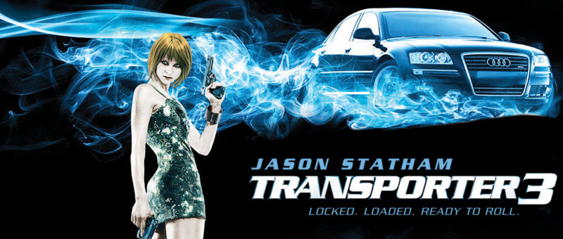
Transporter 3
I'm not big on horror flicks--even the comedic kind--but there is a similar disconnect with the poster for Slither. In the marketing materials, we see a girl in the tub descended upon by alien slugs. How the scene plays out is quite different:
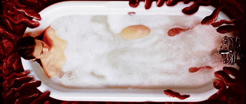
Slither
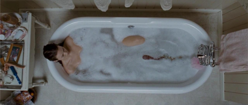
Single Slug
I was surprised by how much I'd been led astray by the marketing materials for this campy horror flick. I shouldn't have been. We've been "lied" to for years. Consider the movie poster for Jaws:
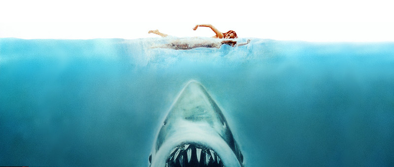
Jaws Poster
In the film, we don't see the shark here and she's floating (not swimming) at night when attacked.
So why "lie" to us? Because movie posters and DVD jackets and trailers are all designed to give you a feel for what you're about to watch. It doesn't really matter if what we are shown is exactly what happens in the flick. Indeed, it's often better to be told what the film is about--and be shown something not in the film--than to be given a snapshot from the movie that doesn't communicate. Put another way:
Communication trumps reality.
This can be disappointing, however, when the part you're most looking forward to in a film is cut. Like the line from the Live Free or Die Hard trailer:
"What are you going to do?"
"I'm going to kill this guy and get my daughter. Or go get my daughter and kill this guy. Or kill all of 'em."
~Luke Holzmann
Your Media Production Mentor

Transporter 3
I'm not big on horror flicks--even the comedic kind--but there is a similar disconnect with the poster for Slither. In the marketing materials, we see a girl in the tub descended upon by alien slugs. How the scene plays out is quite different:

Slither

Single Slug
I was surprised by how much I'd been led astray by the marketing materials for this campy horror flick. I shouldn't have been. We've been "lied" to for years. Consider the movie poster for Jaws:

Jaws Poster
In the film, we don't see the shark here and she's floating (not swimming) at night when attacked.
So why "lie" to us? Because movie posters and DVD jackets and trailers are all designed to give you a feel for what you're about to watch. It doesn't really matter if what we are shown is exactly what happens in the flick. Indeed, it's often better to be told what the film is about--and be shown something not in the film--than to be given a snapshot from the movie that doesn't communicate. Put another way:
Communication trumps reality.
This can be disappointing, however, when the part you're most looking forward to in a film is cut. Like the line from the Live Free or Die Hard trailer:
"What are you going to do?"
"I'm going to kill this guy and get my daughter. Or go get my daughter and kill this guy. Or kill all of 'em."
~Luke Holzmann
Your Media Production Mentor
10.11.2012
Image Inspiration: Face and Shadows
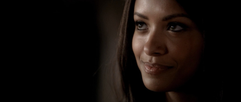
Kat Graham
Color "grading" is the process of making your image look awesome. In this case, the light plunges gracefully into shadow. But something tells me they actually masked to black on the left side of the frame. There's nothing wrong with using all the tools in your toolkit to make an image more beautiful.
You know, like taking a snap from your college dorm and turning it into something awesome...
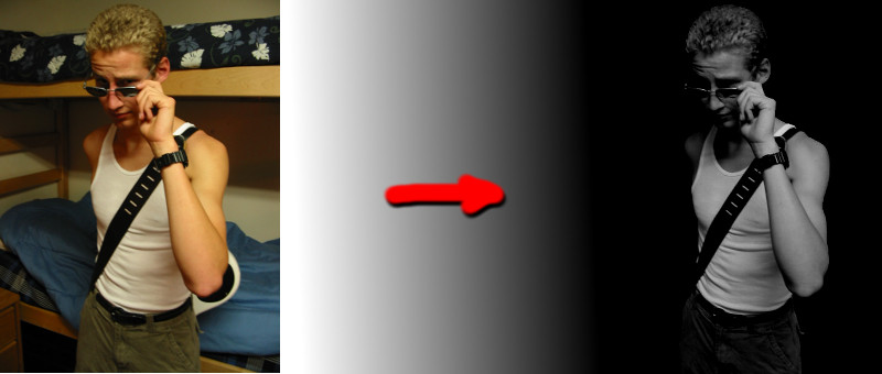
Yes, please.
~Luke Holzmann
Your Media Production Mentor
10.06.2012
The Purpose of a Voice Over
The purpose of narration is to add depth to your world, not tell your audience what's happening.
So many films get this wrong. Rather than open a story visually (the way Up and Sucker Punch do), they have someone explain what's going on... even when it's unnecessary (as they do in the opening of Snow White). Thankfully, Rian Johnson knows how to write. He has the perfect blend of Voice Over (VO) and visual story telling at the beginning of Looper. We can see exactly what's going on, but we don't know why. To help explain this, our narrator sheds light on the world we have been ushered into.
Let me give you an example:
Snow White: We've just seen the queen ill and now she's dead. Cut to a shot of the king grieving and we are told, "The king was inconsolable."
Looper: We see a person suddenly appear on a tarp and get blown away by a guy with a gun. "Time travel will be invented and immediately outlawed..."
In the first example, we already know the king is sad. Telling us this in VO doesn't help us at all. Indeed, the majority of the narration for Snow White is completely pointless. In the second, we now know how these people warp into place and why. We come to understand the intricacies of the world we are shown.
In film, show, don't tell. If it's something that can't be communicated by showing--like someone's reasoning or a ton of history--put the outcome of that idea on the screen (executioners in the past who knock off people from the future) and tell us about why. Do not give us a voice over about something you should have put on the screen.
~Luke Holzmann
Your Media Production Mentor
10.03.2012
Why Snow White Wasn't Charming
There are several lessons to be gleaned from Snow White and the Huntsman. Three of my friends warned me away from the flick because it was "the worst movie they'd ever seen." I'm pretty sure that was more group-think than fact, but I skipped the theater anyway. One of my other friends had picked up the DVD and graciously lent it to me. She conceded that the film was flawed but that, other than Kristen Stewart, there were many redeeming elements. So what do I think?
1. A bad lead will kill your film. I realize that you and I are beggars so we can't be choosers, but keep this in mind: Even if you have the hots for someone, don't cast them if they aren't going to kick your movie up a notch. Stewart was amazing...ly... deadpan. I have created a graphic to illustrate:
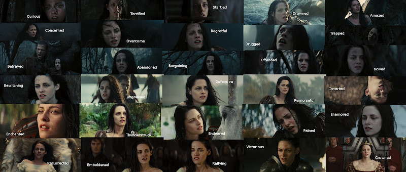
The Many Faces of Kristen Stewart (click for larger version)
But we knew this already. Her's was the first face to make me wish the antagonist won when I saw the trailer all those many moons ago. Charlize is just that much more talented and compelling.
Do not let your personal feelings about an actor get in the way of telling your story.
2. Combine redundant characters. The Huntsman is pining for his lost love, can kick butt, and seeks to take care of Snow White. William has been pining for his lost love, can kick butt, and seeks to take care of Snow White. Ummm... make them one character!
I get it: Kristen's always up for a love triangle. But that's not what we have in this movie. In the end, neither boy is with her and we never see any of them connect. Plus, the idea of pure Snow White falling for two boys is out of character. She likes birds, not boys.
Girls like stories where they have to (get to?) choose between two boys. Typically this is the choice between the bad boy and the best friend. In Snow White's case it's the choice between the dude she just met and the guy she knew once a long time ago. ...again, the similarities are painful.
Even if your source material contains two characters, and you really like possibilities of playing them off each other, do yourself a favor and combine as many characters as possible. This is the role of adaptation. Your story will be much better for it.
3. Having a visual for your story is not visual storytelling. In the behind the scenes, there was lots of talk about storyboards and having a strong visual sense. Of course, if you watch Rupert's commercials and art pieces, you'll notice that a few the visuals from the film were borrowed from his other projects [NB: The video linked contains partial nudity... meaning, you don't see "anything" but there is a lot of naked skin].
Snow White has some really sweet images. But they have little to do with the story. Indeed, I'm willing to bet that the director even had some ideas as to what was going on when he filmed these scenes, but he failed to communicate why they were there. I've made much the same mistake ...as a film student. His producers and editors should have caught this and fixed it before releasing the movie.
Visual storytelling is the art of using images to convey your meaning. Snow White failed to do this over and over again. In fact, in the opening minutes when he actually had some visuals to tell his story (and actors strong enough to pull it off), he ruined it by slapping together a voice over from a character we won't meet for another 40 minutes and who does not, I might add, return to sum things up at the end.
I've recently written several posts that give examples of telling your story through moving pictures: using a visual vice, giving someone humanity, and gaining your audience's trust.
The end of the movie left us hanging. Not only did Kristen look no more interested in her coronation than she did, say, dying, but her two "love interests" were hardly there, and we were left with nothing at the end except a branch with blossoms on it that someone had hacked off a tree and left for Snow White to pick up. A symbol of life returning? Then why cut it off the tree? Why not zoom out of the throne room and past a blooming tree, a la Return of the King?
Please, as you work on your next script, remember to use your pictures to tell your story. Fight against the urge to have a narrator.
What was good? The costumes, some of the effects, and the reminder that you--even without fancy effects or big name actors--can make a better movie.
Now get to it!
~Luke Holzmann
Your Media Production Mentor
1. A bad lead will kill your film. I realize that you and I are beggars so we can't be choosers, but keep this in mind: Even if you have the hots for someone, don't cast them if they aren't going to kick your movie up a notch. Stewart was amazing...ly... deadpan. I have created a graphic to illustrate:

The Many Faces of Kristen Stewart (click for larger version)
But we knew this already. Her's was the first face to make me wish the antagonist won when I saw the trailer all those many moons ago. Charlize is just that much more talented and compelling.
Do not let your personal feelings about an actor get in the way of telling your story.
2. Combine redundant characters. The Huntsman is pining for his lost love, can kick butt, and seeks to take care of Snow White. William has been pining for his lost love, can kick butt, and seeks to take care of Snow White. Ummm... make them one character!
I get it: Kristen's always up for a love triangle. But that's not what we have in this movie. In the end, neither boy is with her and we never see any of them connect. Plus, the idea of pure Snow White falling for two boys is out of character. She likes birds, not boys.
Girls like stories where they have to (get to?) choose between two boys. Typically this is the choice between the bad boy and the best friend. In Snow White's case it's the choice between the dude she just met and the guy she knew once a long time ago. ...again, the similarities are painful.
Even if your source material contains two characters, and you really like possibilities of playing them off each other, do yourself a favor and combine as many characters as possible. This is the role of adaptation. Your story will be much better for it.
3. Having a visual for your story is not visual storytelling. In the behind the scenes, there was lots of talk about storyboards and having a strong visual sense. Of course, if you watch Rupert's commercials and art pieces, you'll notice that a few the visuals from the film were borrowed from his other projects [NB: The video linked contains partial nudity... meaning, you don't see "anything" but there is a lot of naked skin].
Snow White has some really sweet images. But they have little to do with the story. Indeed, I'm willing to bet that the director even had some ideas as to what was going on when he filmed these scenes, but he failed to communicate why they were there. I've made much the same mistake ...as a film student. His producers and editors should have caught this and fixed it before releasing the movie.
Visual storytelling is the art of using images to convey your meaning. Snow White failed to do this over and over again. In fact, in the opening minutes when he actually had some visuals to tell his story (and actors strong enough to pull it off), he ruined it by slapping together a voice over from a character we won't meet for another 40 minutes and who does not, I might add, return to sum things up at the end.
I've recently written several posts that give examples of telling your story through moving pictures: using a visual vice, giving someone humanity, and gaining your audience's trust.
The end of the movie left us hanging. Not only did Kristen look no more interested in her coronation than she did, say, dying, but her two "love interests" were hardly there, and we were left with nothing at the end except a branch with blossoms on it that someone had hacked off a tree and left for Snow White to pick up. A symbol of life returning? Then why cut it off the tree? Why not zoom out of the throne room and past a blooming tree, a la Return of the King?
Please, as you work on your next script, remember to use your pictures to tell your story. Fight against the urge to have a narrator.
What was good? The costumes, some of the effects, and the reminder that you--even without fancy effects or big name actors--can make a better movie.
Now get to it!
~Luke Holzmann
Your Media Production Mentor
9.27.2012
On Pandas and Writing for TV
My wife just got Pandaria, so I'm probably not going to see her for a few weeks.

Lost in the Mists of Pandaria
I, on the other hand, was much more productive in finishing the first season of Revenge. As the "shocking" twist came in the last few seconds, the world of television writing snapped into focus: There's a reason great shows die slow deaths.
We start with a killer story. In this case, a beautiful, young, independently wealthy, brilliant, and accomplished girl seeks out... er... revenge. The writing is snappy, the episodes rocket forward as she takes out her betrayers one at a time. And then, somewhere around episode seven, I sensed the shift as the story began to fall.
This is, near as I can tell, when ABC noticed that they had a hit show on their hands... second only to their similarly ill-fated Lost. Around this time someone at the studio said something to a writer about expanding the show into more seasons. And instantly the guilty stopped falling.
In the place of ruined lives, the story screeches to a halt while we investigate just how horrible we can make things for people. Each episode makes your skin crawl with the intoxicating nastiness that spills onto the screen. But we've lost the plot. Revenge, to be sure, but no longer against perpetrators of a crime... but a mafia-esque family I haven't seen since Godfather.
Indeed, the final episode of season one felt like a bad joke. Things twisted and turned in ways that felt forced and cheap. And I realized that my wife had made the better choice.
See, Blizzard Entertainment learned something about entertainment that ABC has yet to do: Sometimes we need to reel in our stories. Over the past few expansions, Blizzard has been forced to come up with ever bigger and badder bad guys for our hordes and alliances to fight. It's kind of like telling your audience that, I don't know, your mom's still out there. <cough> Chuck.
At some point you should just go back to your roots. Create something new and enjoyable. Change the scenery. Add pandas.
It's tempting to string out a series for seven seasons because it's popular. It's good business sense. It can even be good for fans, especially those who didn't start watching until that season...
But it's bad for your story.
Revenge was a fantastic, one season tale that has now been stretched to at least two. And, like Bilbo Baggins and so many of the "shorts" I see, it's like butter scraped over too much bread.
Don't you make the same mistake. Keep your short, movie, or series only as long as it needs to be. Give into the temptation to stretch it out a little longer, and you'll end up with a monster I wish I could have seen it's original form.
~Luke Holzmann
Your Media Production Mentor
9.23.2012
Revisiting Vice
I've already written how comedy--and scripts--should flow and circle back around on an idea. The reverse of this is equally powerful. Give your character a vice and help them overcome it. Then, when you need your audience to know the full extent of a crushing situation, drop the vice back into your hero's life. A relapse is a terrible blow, and one to which most of us can relate.
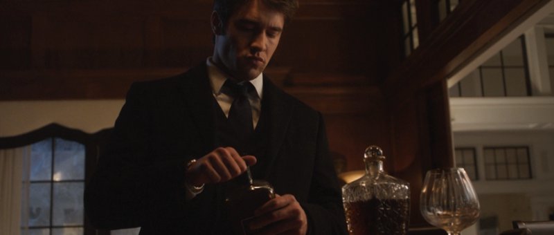
A Problem Worth Drinking Away?
Give you audience something to root for, and you'll have them by their heartstrings when you tear that away from them. The beauty of this is that now they can't wait to see how--or if--your character will ultimately overcome.
~Luke Holzmann
Your Media Production Mentor
9.22.2012
RE Revenge
Include this in the "does not really matter at all" section, but I'm pretty sure I figured out where Emily Thorne buys her mugs:
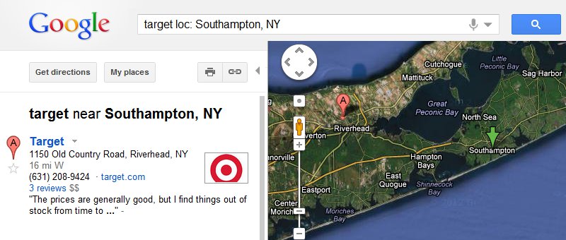
Southampton Target
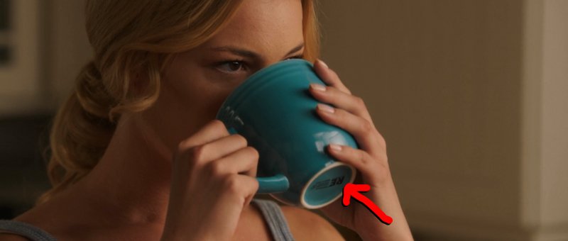
Emily's Room Essentials
If you've been wanting to match your home's decorum to that of a billionaire heiress, pick up this set of 8 Room Essentials Stoneware Mugs for a whopping $15.99.
The lesson?
In film, it is far more important to look and act the part than worry about reality. Who care's if most college dorms have the same set of dishes? No one. These little details are humorous, but the story matters more. Show your audience that your character can buy a building as part of a master plan of revenge, and it won't matter that her furnishings are on par with our own.
What doesn't work is to have your characters say things that completely contradict what your audience sees. For example, while walking through a barren warehouse in Atlas Shrugged: Part 1, Dagny says, "Looks like they just walked away." Uh...
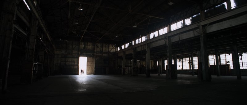
No, it doesn't.
And, unless it's a comedy, don't say that you're looking at "incredibly sophisticated" stuff when the audience can clearly see that the room is full of paper, jars, and a couple cheap shelving units.
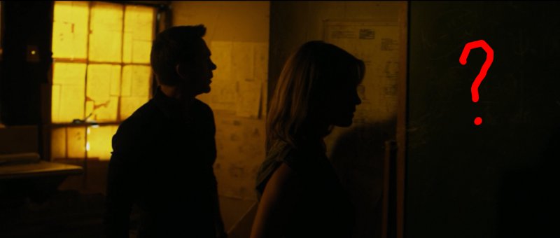
The Incredibly Sophisticated Chalkboard
Make sure your scenes look the part, but feel free to save money on props. It just needs to be believable.
~Luke Holzmann
Your Media Production Mentor

Southampton Target

Emily's Room Essentials
If you've been wanting to match your home's decorum to that of a billionaire heiress, pick up this set of 8 Room Essentials Stoneware Mugs for a whopping $15.99.
The lesson?
In film, it is far more important to look and act the part than worry about reality. Who care's if most college dorms have the same set of dishes? No one. These little details are humorous, but the story matters more. Show your audience that your character can buy a building as part of a master plan of revenge, and it won't matter that her furnishings are on par with our own.
What doesn't work is to have your characters say things that completely contradict what your audience sees. For example, while walking through a barren warehouse in Atlas Shrugged: Part 1, Dagny says, "Looks like they just walked away." Uh...

No, it doesn't.
And, unless it's a comedy, don't say that you're looking at "incredibly sophisticated" stuff when the audience can clearly see that the room is full of paper, jars, and a couple cheap shelving units.

The Incredibly Sophisticated Chalkboard
Make sure your scenes look the part, but feel free to save money on props. It just needs to be believable.
~Luke Holzmann
Your Media Production Mentor
9.21.2012
9.15.2012
First Year of Free Film School
This morning marks my first complete year offering a free film school 101 course. Let's glance at the numbers:
What's happened this year? I have been busy creating and working to promote this course. I have also blogged a couple times each month and begun work on another short (now in post-production). Currently 72 hours of footage is uploaded to YouTube every minute, so I'm not surprised my little free film classes haven't been seen by more people. I am hoping, however, that this coming year will produce several "graduates" and more incoming aspiring filmmakers looking to start their journey in media production.
What else is ahead this coming year? I may start teaching a film class or two at a local college, just for fun. I hope to produce a couple of shorts, complete with behind the scenes and write-ups detailing what I've learned. I'm also committed to help you hone your video skills. If there's anything I can do to help, please let me know!
Thanks so much for being part of the Production-Now.com community! I'm looking forward to seeing what you create in this coming year.
~Luke Holzmann
Your Media Production Mentor
- 1,200 people have expressed interest in this DIY movie making class by visiting the Filmmaking 101 page.
- 147 students have subscribed to have the lessons emailed to them.
- 17 students have completed the first assignment.
- No one, as of yet, has finished the program.
- 5,900 people have watched the most popular video: Paper Floor: Basement Improvement Project. ...somehow, I don't think they are interested in making films.
What's happened this year? I have been busy creating and working to promote this course. I have also blogged a couple times each month and begun work on another short (now in post-production). Currently 72 hours of footage is uploaded to YouTube every minute, so I'm not surprised my little free film classes haven't been seen by more people. I am hoping, however, that this coming year will produce several "graduates" and more incoming aspiring filmmakers looking to start their journey in media production.
What else is ahead this coming year? I may start teaching a film class or two at a local college, just for fun. I hope to produce a couple of shorts, complete with behind the scenes and write-ups detailing what I've learned. I'm also committed to help you hone your video skills. If there's anything I can do to help, please let me know!
Thanks so much for being part of the Production-Now.com community! I'm looking forward to seeing what you create in this coming year.
~Luke Holzmann
Your Media Production Mentor
9.06.2012
The Remix Mashup: A New Story from the Old
The first mashup that I heard was probably the one "proving" that all Nickelback songs sound the same. It was impressive to me then because I was young, I have no personal musical talent, and the experience was new to me.
Since then, friends have introduced me to the "Top of the Pops" Germany-Mashups, like the 2012 Pop Mashup. The editing is unbelievable, but the video contains profanity and suggestive images... just like the original songs. What's inspiring to me is that artists deeply embedded in our "remix culture" have taken the art to the point where they can mashup not just audio or video... but both at the same time.
That's amazing.
They take popular, well-produced media and create a new, equally well-produced product. They use the elements from the original "stories" to create their own.
I've already discussed how you can get excellent editing practice by cutting to techno. I'd recommend cutting a mashup if I didn't think the process would be so insanely frustrating.
If you're up for it, and you're willing to risk current copyright law, I'd love to see what you produce.
~Luke Holzmann
Your Media Production Mentor
8.28.2012
Use Your Frame to Express the Emotion
You can have your character say, "All my friends are gone," until she's blue in the face. But your audience won't get that feeling until you show them the reality.
It can feel cheap and fake, but there's a reason filmmakers use their framing to express an emotion. By isolating our character in the frame between some trees, we know she's alone.
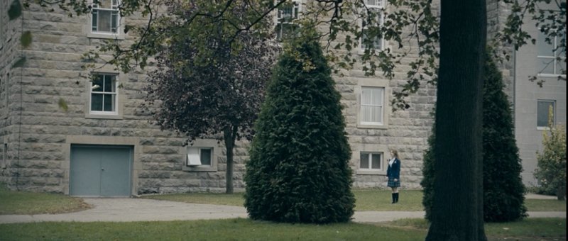
Isolation
The editor/director could have used a very pretty shot of her--even at night--but none of them communicate the same feeling of loneliness and despair like the above shot from far away.
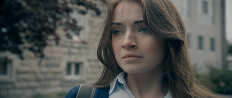
Sarah Bolger
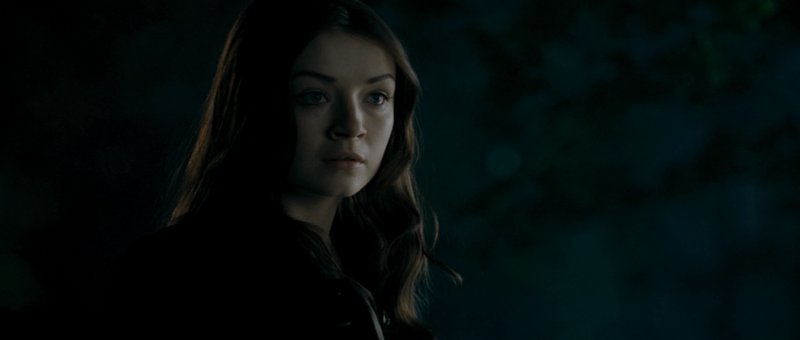
in The Moth Diaries
I'll say this again and again: Movies are a visual media. Use your framing to emphasize and illustrate the feelings and experiences of your characters.
~Luke Holzmann
Your Media Production Mentor
It can feel cheap and fake, but there's a reason filmmakers use their framing to express an emotion. By isolating our character in the frame between some trees, we know she's alone.

Isolation
The editor/director could have used a very pretty shot of her--even at night--but none of them communicate the same feeling of loneliness and despair like the above shot from far away.

Sarah Bolger

in The Moth Diaries
I'll say this again and again: Movies are a visual media. Use your framing to emphasize and illustrate the feelings and experiences of your characters.
~Luke Holzmann
Your Media Production Mentor
8.21.2012
Add Multiple Videos to YouTube Embed Without Creating a Playlist
I wanted to know how to embed multiple YouTube videos on my blog without having to create a unique playlist. The idea was to use the YouTube embed code to include multiple videos in a single player using a list of URLs or Video IDs.
It turned out to be really easy (after an hour of searching):
Step 1: Choose the first video you want and grab the embed code from YouTube.
Step 2: Add the playlist parameter after the first Video ID.
Step 3: To add to this embeded custom playlist, simply include the ID for each additional video separated by a comma.
Step 4: Feel free to include the usual &rel=0 (this makes it so YouTube doesn't recommend other videos once yours are done playing). And if you want to show all the videos in the playlist on the start screen, include &showinfo=1 (play with this one to see what it does).
Here's how my first attempt turned out:
I created it to show off some of the Assignment 1 samples from my free Filmmaking 101 course.
~Luke Holzmann
Your Media Production Mentor
*This tutorial will also be useful if you want to know:
It turned out to be really easy (after an hour of searching):
Step 1: Choose the first video you want and grab the embed code from YouTube.
<iframe width="560" height="315" src="http://www.youtube.com/embed/hcdQnK84Pl4" frameborder="0" allowfullscreen></iframe>
Step 2: Add the playlist parameter after the first Video ID.
<iframe width="560" height="315" src="http://www.youtube.com/embed/hcdQnK84Pl4?playlist= " frameborder="0" allowfullscreen></iframe>
Step 3: To add to this embeded custom playlist, simply include the ID for each additional video separated by a comma.
<iframe width="560" height="315" src="http://www.youtube.com/embed/hcdQnK84Pl4?playlist=WnVbH7osG5U,7iw30sK2UCo,sYV5MTy0v1I" frameborder="0" allowfullscreen></iframe>
Step 4: Feel free to include the usual &rel=0 (this makes it so YouTube doesn't recommend other videos once yours are done playing). And if you want to show all the videos in the playlist on the start screen, include &showinfo=1 (play with this one to see what it does).
http://www.youtube.com/embed/hcdQnK84Pl4?rel=0&showinfo=1&playlist=-h6_49kfz-M,joUDSqGU2f4,qzr4wNeb-Xc,BF6DsE13w_Y,WnVbH7osG5U,nb7tGYRL-Zw,7iw30sK2UCo,sYV5MTy0v1I
Here's how my first attempt turned out:
I created it to show off some of the Assignment 1 samples from my free Filmmaking 101 course.
~Luke Holzmann
Your Media Production Mentor
P.S. If you are totally new to YouTube embedding, keep in mind:
1. The Video ID is (currently) a string of 11 letters, numbers, or other characters, like: 7XUdN1Q_v-0. If you're watching a video, it's typically the last string of random stuff in your browser's URL bar: http://www.youtube.com/watch?v=7XUdN1Q_v-0
2. When adding extra parameters to your YouTube embed, remember that the first one begins with a ? and all the rest start with an &. Basically, you're telling YouTube: Play this video, oh, I don't want you to show related videos and build me a playlist and start playing the video automatically, etc.
3. Anything else not making sense? Just ask!
*This tutorial will also be useful if you want to know:
- How to make a sharable non-public playlist containing unlisted YouTube videos
- Step-by-step instructions for creating unlisted playlists for YouTube
- How to add videos to a playlist without creating one in your YouTube profile
- ...and more!
8.17.2012
8.13.2012
Use Sound to Create a Shot You Don't Have
Your character is going on a train ride. And the director got a couple cool shots of your actor thinking while the train whizzes along. Unfortunately, the very next shot you have is the train pulling into the station.
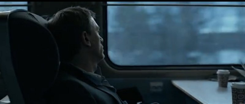
Sitting on a Moving Train
How do you get from one shot to the next without jarring your audience?
Add the sound of the train slowing down to the end of your actor's clip. The background of your visual certainly won't indicate a slowing train, but the audio will help your viewers make the transition.
Often, a simple cut won't work by itself. Add audio cues to make up for shots you don't have.
~Luke Holzmann
Your Media Production Mentor
8.06.2012
The Edge of the Frame
Sometimes your options are limited. In this case, the editor only had a few select royalty-free shots to choose from. This one was shot with an extreme fish-eye lens so a part of the aircraft was in view in one corner and the curved edge of the shot showed up on the other.
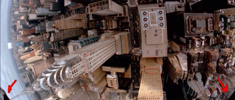
The Edges of the Frame
How much does it matter?
Not a bit. The shot does its job and the scene moves on.
By all means, always aim for excellence. But if it's the difference between finishing your flick and having it perfect... just make your movie.
~Luke Holzmann
Your Media Production Mentor

The Edges of the Frame
How much does it matter?
Not a bit. The shot does its job and the scene moves on.
By all means, always aim for excellence. But if it's the difference between finishing your flick and having it perfect... just make your movie.
~Luke Holzmann
Your Media Production Mentor
7.31.2012
Olympic Lessons: Reflections
Quick special effects tip from a Fruit of the Loom commercial:
Fruit of the Loom - Anthem
They took the time to add reflections to the words. This small detail makes a huge difference in how well the effect works.
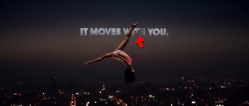
Reflection
Often, effects shots aren't so much about what big things can you do in the shot. Rather, the effectiveness of a sfx visual comes down to the tiny details others overlook and your audience shouldn't notice.
~Luke Holzmann
Your Media Production Mentor
Fruit of the Loom - Anthem
They took the time to add reflections to the words. This small detail makes a huge difference in how well the effect works.

Reflection
Often, effects shots aren't so much about what big things can you do in the shot. Rather, the effectiveness of a sfx visual comes down to the tiny details others overlook and your audience shouldn't notice.
~Luke Holzmann
Your Media Production Mentor
7.29.2012
Olympic Lessons: The Queen's Memorable Moment
I've been annoyed by NBC trying to convince me that the Queen jumping out of a helicopter is her memorable moment of the opening ceremony. It's not. The memorable moment is her scowl:

Look At All These Countries I Used To Own
There are many reasons why the James Bond gag didn't stick. Here are a few of them:
1. We Never Saw It Happen
I already covered this after watching Priest: We didn't get to see the needed moment. In this case, we never saw the Queen land. Her double floated off camera and then, a few seconds later, she walks out of some doors. The two moments were completely disconnected.

2. Continuity
You take the time to get J.K. Rowling, Rowan Atkinson, and Kenneth Branagh. But after filming some segments with Daniel Craig, you can't get him to escort the Queen into the stadium? Seriously? Lame. The fact that Bond wasn't there after the setup further disconnected the two events and made the whole thing utterly unmemorable.
3. There's Something Better
Even if you botch a few key elements--even massively important ones like those outlined above--the audience can forgive you if that's all you give them. To err is human. To fail at producing a solid moment of comedy in the middle of a complex live is event is understandable. But we'll quickly move on if something better comes along. ...something like a scowl during the performance of some special needs children signing your song.
~Luke Holzmann
Your Media Production Mentor
Look At All These Countries I Used To Own
There are many reasons why the James Bond gag didn't stick. Here are a few of them:
1. We Never Saw It Happen
I already covered this after watching Priest: We didn't get to see the needed moment. In this case, we never saw the Queen land. Her double floated off camera and then, a few seconds later, she walks out of some doors. The two moments were completely disconnected.

2. Continuity
You take the time to get J.K. Rowling, Rowan Atkinson, and Kenneth Branagh. But after filming some segments with Daniel Craig, you can't get him to escort the Queen into the stadium? Seriously? Lame. The fact that Bond wasn't there after the setup further disconnected the two events and made the whole thing utterly unmemorable.
3. There's Something Better
Even if you botch a few key elements--even massively important ones like those outlined above--the audience can forgive you if that's all you give them. To err is human. To fail at producing a solid moment of comedy in the middle of a complex live is event is understandable. But we'll quickly move on if something better comes along. ...something like a scowl during the performance of some special needs children signing your song.
~Luke Holzmann
Your Media Production Mentor
7.22.2012
Humanize the Enemy
It's common to dehumanize our enemies. It makes it easier for us to root against them and knock 'em off should the need arise. As long as they aren't human, their suffering and pain doesn't bother us... in fact, it may make us hate them more.
But if you want to turn the tables on your audience so they begin to feel for the bad guy, you have make the enemy a person again. But how? The fact that they are a person isn't enough. We need to create a new kind of connection. One way to do this is spend a ton of time with the person and get to know them. This is the approach of movies as wide and varied as Beauty and the Beast and District 9.
However, if your show isn't really about the bad guys, you don't have time to develop this theme. You need a way to quickly get the audience to go from hoping the guy dies to feeling for his condition. The best way to do this: Give him something uniquely human and vulnerable to do.
In the second episode of Breaking Bad, the starved and almost dead bad guy is given a sandwich. He takes a moment to remove the crust.
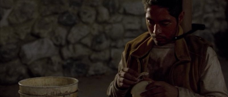
He Doesn't Like the Crust
The scene could have easily been one where he gobbles down the food like an animal... and we'd further despise him. But this simple act snaps him back into humanity. He could be our neighbor, our friend, a relative, or even ... us.
Notice too: This is, in large part, visual storytelling. The actions we give our characters to do in response to situations have profound impacts on how the audience thinks about them.
~Luke Holzmann
Your Media Production Mentor
But if you want to turn the tables on your audience so they begin to feel for the bad guy, you have make the enemy a person again. But how? The fact that they are a person isn't enough. We need to create a new kind of connection. One way to do this is spend a ton of time with the person and get to know them. This is the approach of movies as wide and varied as Beauty and the Beast and District 9.
However, if your show isn't really about the bad guys, you don't have time to develop this theme. You need a way to quickly get the audience to go from hoping the guy dies to feeling for his condition. The best way to do this: Give him something uniquely human and vulnerable to do.
In the second episode of Breaking Bad, the starved and almost dead bad guy is given a sandwich. He takes a moment to remove the crust.

He Doesn't Like the Crust
The scene could have easily been one where he gobbles down the food like an animal... and we'd further despise him. But this simple act snaps him back into humanity. He could be our neighbor, our friend, a relative, or even ... us.
Notice too: This is, in large part, visual storytelling. The actions we give our characters to do in response to situations have profound impacts on how the audience thinks about them.
~Luke Holzmann
Your Media Production Mentor
7.13.2012
Producing a Spoof: An Edit That I Used to Know
Body paint themed music videos first showed up on my screen with the reminder that I am not a robot... which was a relief to hear again. But that meant that when I saw the video by Gotye, I felt like I was seeing a video done by somebody that I used to know.
And now, I've finally had a chance to watch The Star Wars That I Used to Know:
This is an excellent parody. They really knocked it out of the park. But the editing was off at several points. Not really far off, but enough to be painful. In fact, it's so close, it's a little more noticeable than had it been off by a few seconds. Instead, the cuts come 2 to 5 frames too early. Going back and watching the original again confirmed that the edits there flowed, but the parody felt like it skipped and jumped around a few times.
Still well worth the watch! But notice how a cut just a moment too early can snap you out of a an otherwise really great video.
~Luke Holzmann
Your Media Production Mentor
7.06.2012
How to Interview Yourself
One of the problems with being a truly independent filmmaker is that you are all alone. So filming yourself can be problematic. If I'm shooting with a still/video camera hybrid, I stick my camera on a tripod and snap stills of myself until I'm happy with the framing.

Checking My Framing
~Luke Holzmann
Your Media Production Mentor

Checking My Framing
~Luke Holzmann
Your Media Production Mentor
6.29.2012
Camera Shake: Simple, Effective, Invisible
While working on my latest machinima project, I didn't feel the fall was interesting enough. It was bland and unemotional. So, I added a tiny something to make it better:
Fall Comparison
Giving the camera just a tiny bounce/shake when he hit the ground vastly improved the moment.
What little tweaks can you add to your projects to make them better?
~Luke Holzmann
Your Media Production Mentor
Giving the camera just a tiny bounce/shake when he hit the ground vastly improved the moment.
What little tweaks can you add to your projects to make them better?
~Luke Holzmann
Your Media Production Mentor
6.23.2012
Editing Practice: I Prefer Techno
While catching up on VGHS this morning, one ad actually got me to stop and watch it:
Gymnastics In Slow Motion
The video, partly because of the dubstep, reminded me of The Apple Tree Feat. The Glitch Mob. [NB: This video is definitely not suitable for children! It has f-bombs in the lyrics and disturbing/sexually-oriented shots from many R-rated movies. But the editing is superb!] There's something moving about cutting to strong music... especially if you have footage that can be slowed way down via time remapping.
If you've been interested in improving your editing skills, I highly recommend grabbing a ton of footage you've shot and cutting it together to an awesome rhythmic song. Dubstep is great, but I prefer techno.
Not sure where to get good techno for your edit? I like OverClocked ReMix. What's really cool about ocremix (besides providing free techno) is that the songs there are fan-made. So while there are a lot of less-than-stellar tracks on the site, you can also find some amazing gems created by creative people who love sharing their work.
Normally I caution about letting the length of a song drive your edit, but since the purpose of this exercise is to, well, let the song drive your edit... don't let that hold you back this time.
~Luke Holzmann
Your Media Production Mentor
P.S. Notice how the ad above has a story. The part where she falls, and the moments after that, are wonderfully executed. We are visual storytellers, so tell your story with pictures.
6.16.2012
How to get started in film: Silly and serious advice
I had the opportunity to sit in on a film panel at the CHEC Super Conference. The panelists noted--correctly--that homeschoolers are increasingly interested in making movies. But how do you get started? Where do you go for help? And what equipment do you need?
First, what kind of equipment do you need and how do you learn how to use it? The panelists all agreed that you should just get the highest quality equipment you have access to and begin using it. I totally concur. We learn how to make movies by practicing. And quality comes from mostly how you use what you have... not what kind of camera or computer you own.
This is the focus of the Production-Now.com Filmmaking 101 course. Imagine you have a camera and someone tells you to "just go practice and you'll get better." The advice, while true, is ultimately rather unhelpful. The question is: How do you practice? What kinds of things should I be practicing? Hearing that you should "get better at lighting and camera angles" is pointless. How do you get better at practicing lighting?
You'll do that in Assignment 3: The Shadows Prove the Light.
What the film panel at CHEC completely missed was the opportunity to offer the 70 aspiring movie makers in the room tangible, practical steps to get started. And that made me sad. They should offer more.
The panel did suggest you attend the Christian Filmmakers Academy, but that has a steep cost in dollars, time, travel, and even ideology.
Second, what should you do as you get started? One of the speakers said that some of the worst advice he ever got was to "just go out and make a bunch of silly projects." He said, "Why not take the time to make something meaningful instead?" So he took a year to create a documentary, and now sits on a film panel at CHEC. Success.
Sadly, I think he missed the point of the advice entirely. In fact, the 10 minutes of Pro Tips from Freddie Wong offer better advice than the panel in a sixth the time. FeddieW gives much the same "silly" advice when he says you don't improve if you're not practicing. Brandon follows up with an excellent point that too often people get discouraged because they believe they have one idea and after months of working on it, it's not as good as they had hoped. Better to just use what you have to make something, finish it, and move on to the next thing.
That's the point of making "silly" shorts at the start. Too often Christian filmmakers fail because they are focused on producing something "meaningful" with a message and forget to make a movie. This was exactly my point when I contrasted Kinsey and Facing the Giants. Spend some time learning how to tell a story, then try to convey a message. Do not get hung up on some unbiblical pressure to always be producing something meaningful to the Kingdom. Spend your time preparing before stepping out into ministry. Christ certainly did. And He's the Son of God.
Third, I want to return to the ideology of the San Antonio Independent Christian Filmmakers. This bad theology drives much of the terrible advice they dole out. They believe several things:
They use the story of David and Goliath. They also reference the Babylon of Revelation. And they miss the point.
Granted, we are not all called to be Daniel, a follower of God who became chief magician in the heart of literal Babylon. I'm certainly no Daniel. I moved to Colorado because I didn't like the way Hollywood went about producing things. I didn't like the lying. The waste. The tone. I was also such a small and insignificant person, I wouldn't matter there. So I went online to try to help those I could: People just starting out on their film making journey. So I'm not against leaving Hollywood. But we should do it for the right reasons.
Leaving the "hive of scum and villainy" to pursue a Christian bubble of filmmakers misses the point of the Gospel. Those in Hollywood, like the Hollywood Prayer Network and Mastermedia, are being far more biblically minded by praying for redemption and being salt and light in this dark world.
The point? Whether you find yourself in Hollywood or San Antonio or YouTube, may your focus be on creating media that tells redemptive stories. But for now, while you're still getting started in film, please be free of the burden to change the world. It's okay to practice.
~Luke Holzmann
Your Media Production Mentor
First, what kind of equipment do you need and how do you learn how to use it? The panelists all agreed that you should just get the highest quality equipment you have access to and begin using it. I totally concur. We learn how to make movies by practicing. And quality comes from mostly how you use what you have... not what kind of camera or computer you own.
This is the focus of the Production-Now.com Filmmaking 101 course. Imagine you have a camera and someone tells you to "just go practice and you'll get better." The advice, while true, is ultimately rather unhelpful. The question is: How do you practice? What kinds of things should I be practicing? Hearing that you should "get better at lighting and camera angles" is pointless. How do you get better at practicing lighting?
You'll do that in Assignment 3: The Shadows Prove the Light.
What the film panel at CHEC completely missed was the opportunity to offer the 70 aspiring movie makers in the room tangible, practical steps to get started. And that made me sad. They should offer more.
The panel did suggest you attend the Christian Filmmakers Academy, but that has a steep cost in dollars, time, travel, and even ideology.
Second, what should you do as you get started? One of the speakers said that some of the worst advice he ever got was to "just go out and make a bunch of silly projects." He said, "Why not take the time to make something meaningful instead?" So he took a year to create a documentary, and now sits on a film panel at CHEC. Success.
Sadly, I think he missed the point of the advice entirely. In fact, the 10 minutes of Pro Tips from Freddie Wong offer better advice than the panel in a sixth the time. FeddieW gives much the same "silly" advice when he says you don't improve if you're not practicing. Brandon follows up with an excellent point that too often people get discouraged because they believe they have one idea and after months of working on it, it's not as good as they had hoped. Better to just use what you have to make something, finish it, and move on to the next thing.
That's the point of making "silly" shorts at the start. Too often Christian filmmakers fail because they are focused on producing something "meaningful" with a message and forget to make a movie. This was exactly my point when I contrasted Kinsey and Facing the Giants. Spend some time learning how to tell a story, then try to convey a message. Do not get hung up on some unbiblical pressure to always be producing something meaningful to the Kingdom. Spend your time preparing before stepping out into ministry. Christ certainly did. And He's the Son of God.
Third, I want to return to the ideology of the San Antonio Independent Christian Filmmakers. This bad theology drives much of the terrible advice they dole out. They believe several things:
- Hollywood is evil.
- We must be separate from evil.
- Therefore we should pray for and pursue a world without Hollywood.
They use the story of David and Goliath. They also reference the Babylon of Revelation. And they miss the point.
Granted, we are not all called to be Daniel, a follower of God who became chief magician in the heart of literal Babylon. I'm certainly no Daniel. I moved to Colorado because I didn't like the way Hollywood went about producing things. I didn't like the lying. The waste. The tone. I was also such a small and insignificant person, I wouldn't matter there. So I went online to try to help those I could: People just starting out on their film making journey. So I'm not against leaving Hollywood. But we should do it for the right reasons.
Leaving the "hive of scum and villainy" to pursue a Christian bubble of filmmakers misses the point of the Gospel. Those in Hollywood, like the Hollywood Prayer Network and Mastermedia, are being far more biblically minded by praying for redemption and being salt and light in this dark world.
The point? Whether you find yourself in Hollywood or San Antonio or YouTube, may your focus be on creating media that tells redemptive stories. But for now, while you're still getting started in film, please be free of the burden to change the world. It's okay to practice.
~Luke Holzmann
Your Media Production Mentor
6.08.2012
6.03.2012
Better Left Unsaid
As I watched Division of Gravity, one thought kept going through my mind: 'This would be so much better without any dialog or voice over.'
If you can handle some f-bombs, check it out:
This is a beautifully shot visual story. And, because of that, it's far better left as just that: A visual story. The words--especially the swearing--heavily detract from the events. Worse, the lame voice over communicates nothing of value. In fact, ending with "We learn..." further emphasizes just how little we've learned from the words crammed into the background of this short.
I'd recommend watching this piece with the audio muted, but the music is integral to the pacing and emotion. I would have been happier if the words were in gibberish or a foreign language. Again: What is said, specifically, doesn't matter. It's the tone and rhythm that carry the mood.
The raw emotion and the pain and difficulty of maintaining a relationship is beautifully (and tragically) portrayed in the images. The words cheapen the experience. Better to have left the words unsaid so the message could be better heard.
What words should you cut from your next piece?
~Luke Holzmann
Your Media Production Mentor
6.02.2012
Editing Tips from Drive
I noticed a couple things while watching Drive.
[Aside: The film has not received good marks, and I think the biggest reason is that it simply wasn't fun. As an audience we expect more of a Transporter kind of experience when watching a driving movie... not a film where people get their faces kicked in and a love story with an ambiguous ending. We can handle a violent movie if that's what we expect. And I, for one, did not expect that when I fired up this flick.]
1. If you're making a movie about a guy who drives for a living, try to include takes where he demonstrates an ability to park. I realize you, as an editor, can't create takes the crew doesn't shoot. So, if you're directing a movie about a guy who drives for a living, try to get shots that demonstrate he can park.
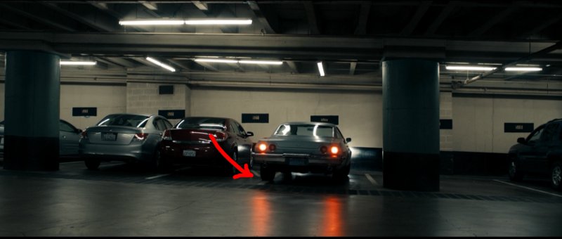
This Driver Can't Park
2. I really loved one edit in the film. It cut from a shot inside the car to another, very similar shot at a different angle. The edit worked because the scene through the windshield changed dramatically, from trees to a street. But the other major contributing factor to the effective nature of the cut was that your eye tracked with the watch on the actor's wrist.
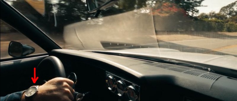
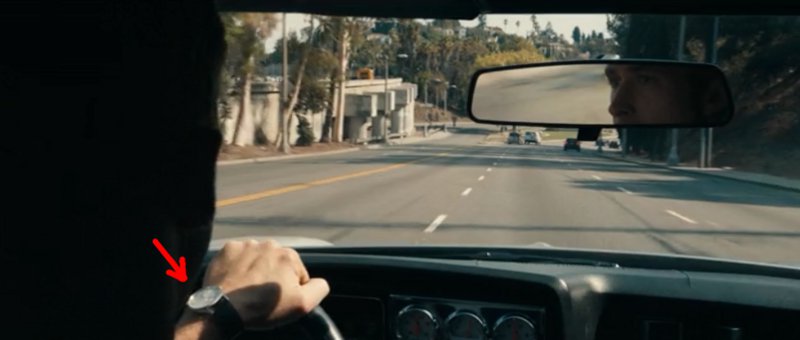
Effective Edit: Give the Audience Something to Track
This edit could easily have been a jump cut. But by giving the audience something to follow through the edit, the cut was beautiful.
~Luke Holzmann
Your Media Production Mentor
[Aside: The film has not received good marks, and I think the biggest reason is that it simply wasn't fun. As an audience we expect more of a Transporter kind of experience when watching a driving movie... not a film where people get their faces kicked in and a love story with an ambiguous ending. We can handle a violent movie if that's what we expect. And I, for one, did not expect that when I fired up this flick.]
1. If you're making a movie about a guy who drives for a living, try to include takes where he demonstrates an ability to park. I realize you, as an editor, can't create takes the crew doesn't shoot. So, if you're directing a movie about a guy who drives for a living, try to get shots that demonstrate he can park.

This Driver Can't Park
2. I really loved one edit in the film. It cut from a shot inside the car to another, very similar shot at a different angle. The edit worked because the scene through the windshield changed dramatically, from trees to a street. But the other major contributing factor to the effective nature of the cut was that your eye tracked with the watch on the actor's wrist.


Effective Edit: Give the Audience Something to Track
This edit could easily have been a jump cut. But by giving the audience something to follow through the edit, the cut was beautiful.
~Luke Holzmann
Your Media Production Mentor
5.29.2012
Story Telling with a Glance
Bad filmmakers rely on characters spelling out their feelings verbally.
Tony: My life is miserable without you, Sheila. I love you too much to leave you.
Sheila: You do? Then why did you leave me for ten years to be with Cindy?
Tony: That was a mistake. I've really only ever loved you.
We the audience--not to mention Sheila--should be very distrustful of Tony at this point. But, too often, these kinds of lame lines of dialog are all we get to see of the depth of a relationship. Filmmakers pass these moments off as creating a deep-emotional connection. And it's sad.
Far better to tell this stuff visually. If you have a character who is a lying, cheating, womanizer, how do you get the audience to believe he actually likes a girl "for real"? We can't trust what he says. So we switch to what film allows us to do: Visual Storytelling. We can, with a glance, tell more about our character than a thousand words would convey. By having him walk past a couple with arms around each other, we can have his look show the audience that he is missing out on that.
And it takes less than 15 frames to do it.
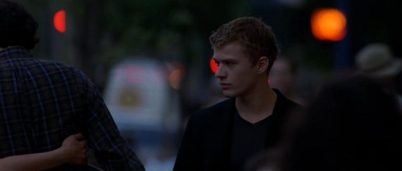
Missing a Relationship in a Glance
Granted, it can be difficult and time consuming to create these moments. They may require you to get outside your set, find some extras, take your production elsewhere. But it's so worth it. Your world gets bigger, your characters deeper, and your story stronger.
Tell your story with a glance, not a bunch of dialog.
~Luke Holzmann
Your Media Production Mentor
Tony: My life is miserable without you, Sheila. I love you too much to leave you.
Sheila: You do? Then why did you leave me for ten years to be with Cindy?
Tony: That was a mistake. I've really only ever loved you.
We the audience--not to mention Sheila--should be very distrustful of Tony at this point. But, too often, these kinds of lame lines of dialog are all we get to see of the depth of a relationship. Filmmakers pass these moments off as creating a deep-emotional connection. And it's sad.
Far better to tell this stuff visually. If you have a character who is a lying, cheating, womanizer, how do you get the audience to believe he actually likes a girl "for real"? We can't trust what he says. So we switch to what film allows us to do: Visual Storytelling. We can, with a glance, tell more about our character than a thousand words would convey. By having him walk past a couple with arms around each other, we can have his look show the audience that he is missing out on that.
And it takes less than 15 frames to do it.

Missing a Relationship in a Glance
Granted, it can be difficult and time consuming to create these moments. They may require you to get outside your set, find some extras, take your production elsewhere. But it's so worth it. Your world gets bigger, your characters deeper, and your story stronger.
Tell your story with a glance, not a bunch of dialog.
~Luke Holzmann
Your Media Production Mentor
5.20.2012
Painful Edit: Closed Eyes
Editing is feelings based. A bad edit will be painful to watch. Not necessarily a slap-across-the-face kind of pain, but you will feel it. A good edit will slip past, unnoticed.

Yellow Flowers
Yesterday, while playing around with a little practice flick we were assembling, one edit wasn't feeling right. We were cutting from a shot of yellow flowers, but it didn't work. My editing partner suggested it was because the shot was too brief. But I felt the length was just right. The problem was what we cut back to...

Closed Eyes
When we cut to a person, we want to look into their eyes and see what they are thinking. The actor had his eyes closed for this part of the clip, and so the edit didn't work.

Fruit
We added an extra shot of some fruit and the yellow flowers felt perfect.
The lesson: There are many elements that make an edit hurt. Duration of a clip can certainly be one of them. But pay attention to other things too, like blinks and camera motion and lighting changes and position. As you edit, ask yourself if any of the edits are painful. If so, you know you have a problem. The more you edit, the easier it will be for you to see the subtle things that make these edits not work.
Want to see the final product? Enjoy!
The Mysteries of Wildlife
~Luke Holzmann
Your Media Production Mentor

Yellow Flowers
Yesterday, while playing around with a little practice flick we were assembling, one edit wasn't feeling right. We were cutting from a shot of yellow flowers, but it didn't work. My editing partner suggested it was because the shot was too brief. But I felt the length was just right. The problem was what we cut back to...

Closed Eyes
When we cut to a person, we want to look into their eyes and see what they are thinking. The actor had his eyes closed for this part of the clip, and so the edit didn't work.

Fruit
We added an extra shot of some fruit and the yellow flowers felt perfect.
The lesson: There are many elements that make an edit hurt. Duration of a clip can certainly be one of them. But pay attention to other things too, like blinks and camera motion and lighting changes and position. As you edit, ask yourself if any of the edits are painful. If so, you know you have a problem. The more you edit, the easier it will be for you to see the subtle things that make these edits not work.
Want to see the final product? Enjoy!
~Luke Holzmann
Your Media Production Mentor
Subscribe to:
Comments
(
Atom
)


