11.23.2010
A UV Lens Saved My Camera
Until I tried to start shooting and the image was oddly blurry.
That was when I looked at the lens and saw this:
Shattered UV Filter
The filter was toast. Thankfully, since it was a $20 protective lens, I could unscrew it, keep shooting, and purchase a replacement later that afternoon.
Great investment.
Protect your camera's really expensive lens with an inexpensive UV filter. It could save you a ton of grief and keep you shooting in a situation where you otherwise wouldn't be able to.
~Luke Holzmann
Your Media Production Mentor
8.14.2010
Hiding Microphones: The Beach
Nifty.
But if you don't have a clever boom operator and are sticking with body mics, you have to hide them on your actors. But where? While watching a movie this afternoon, I discovered one option:
Body Microphone Taped to the Leg
The microphone is only visible under her blowing dress for about three frames, but I noticed it because the wire flapped around for two-thirds of a second. Most people probably didn't even notice, which is why--again--little blunders and foibles are fine to leave in.
Taping a microphone to your leg isn't going to work for a beach scene where you're wandering around in a French cut Speedo, but it does work if you're wearing a skirt.
~Luke Holzmann
Your Media Production Mentor
8.13.2010
Sucker for Awesome
Sucker Punch Trailer
Granted, it's 100% eye-candy with what appears to be sub-par acting--down to the German accent--but a movie with swords, dragons, dirigibles, cute girls and samurai... yep, I'm a sucker for that.
Hit me.
~Luke Holzmann
Your Media Production Mentor
7.21.2010
Your Enemy the Script
"Good morning, teacher."
The girls of the class sit quietly attentive. One girl gets out her notebook for the day's lesson.
"Settle down now, girls."
...
Wha?
I blinked at the screen. Why did the character just say that? The girls weren't saying anything. They weren't doing anything. In fact, they were behaving incredibly well. So why did their teacher suddenly feel the need to tell them to "settle down"?
Because that was her line. The script told her to. And rather than think about it, she just said it.
Yep, makes me want to throw stuff too
The Lesson: Just because it's in the script does not mean it should be in the scene. Engage your brain while filming, even if you're an actor with a bit part. The script can be your enemy because it was written far away from the set by a person not there now. Perhaps the writer envisioned a boisterous classroom. That's great. But that's not what happened when you got to set.
So change it. The script is your enemy if you feel tied to it instead of what's happening around you.
~Luke Holzmann
Your Media Production Mentor
3.18.2010
The Creation of an Animation - Step 1
It all starts with story. And while writing out a story in script format can be helpful, sometimes it's just too much of a hassle to try to translate it into words and scenes and such.
That's why when I'm about to produce a short, I often print off a couple pages of my handy blank storyboards and start sketching. It's often much easier to convey the gist of my story with pictures. This also helps me think through how the visuals and voice over will interact. I can demonstrate sound effects, camera motion, even expressions faster and easier in this format than in a script.
And here's the beautiful thing: You don't have to be an artist. I'm a stick-figure-drawer kind of guy, and my storyboards totally work:
Frames from My Most Recent Storyboard
All it has to do is communicate. It'd be nice to be Rembrandt if you were trying to create static art. But you're not. You're trying to make a short and the faster you can toss together your pieces the better.
So, get to it!
~Luke Holzmann
Your Media Production Mentor
3.09.2010
Chuck Training - Part 5
I got my screen captures for this series from the ChuckTV.net Gallery. Very nice of them to provide screen captures from every moment of every show. Makes my job easier since the DVD isn't out yet.
~Luke Holzmann
Your Media Production Mentor
Chuck Training - Part 4
Chuck Opening
I'm not a sound guy. In fact, I'm really bad at sound. Simple cutting? Sure. A few added effects when needed? Okay. A little cheesy looped music? I'll try.
But mixing and fixing just ain't my scene.
I took a one-day audio workshop in college. We were given a CD full of sounds, a 30 second clip and two weeks to edit it together.
Two weeks.
About eight days in, a friend of mine approached me. "How's the project going?"
I shrugged. "I threw something together."
"Oh man," he said. "This thing has me so stressed out. I've already put in about 80 hours. I'm going to try to get in a few more before it's due. I just can't get it quite right."
80 hours? It's a 30 second clip. I didn't care if the majority of my grade depended on this thing, it didn't warrant that kind of time. But while my friend was over-ambitious and so paranoid he'd never be hire-able if he kept up that kind of over-thinking, he made an impression on me that day. If you're really into audio, it can become your life.
So watch the above clip again and try to list the sounds they added in addition to the catchy tune.
- Noise Maker Clicking
- Metallic hit
- Woosh
- Bullets
- Zoom Whoosh
- Pop
- Move Woosh
- Slide Woosh
- Breath
- Turn Woosh
- Gun Shot
- Zing
- Cardboard Hit
- Car
- Another Zing
- Squealing Tires
- Car Revving
- More Tires Squealing
- Ping Pinks Down the Stairs
- Zoomp
- Helicopter
- Bink
- Blink
- "He-nt!" (throw)
- Whoosh of Shurikens
- Mew
- Another Woosh
- Zip
- Slow Woosh
- Clicking of Keys
Approximately one "extra" sound bit every second.
That's crazy. While I doubt it took 80 hours, it had to take time to figure out what kind of sound they wanted, find the right sound in their library (or record it), place it in the timeline and then mix it down.
That's 30 seconds of audio for a quick animation piece.
The world of sound blows my mind. But the more attention to detail--and the more layers to add in--the higher your production value.
Just don't take 80 hours to do it or your project will never get done.
~Luke Holzmann
Your Media Production Mentor
3.06.2010
Chuck Training - Part 3
Allan Sepinwall commented that if Jeff could see clearly enough that Chuck and Sarah need to get together, he expects them to do so soon.
Which would be a good thing.
Jeff, playing the fool
Jeff is a fantastic character. He is Chuck's Shakespearian fool: The only one who can safely speak the truth for the audience without giving away anything to his fellow characters.
This is definitely an element to keep in mind for your productions. Not only does "the Fool" have a long literary history as a character, but he is a great tool for communicating something to your audience when your other characters can't/won't admit it.
~Luke Holzmann
Your Media Production Mentor
3.05.2010
Chuck Training - Part 2
I feel like I know Chuck. He's a buddy of mine by now. He's a good guy who, despite his passionate longing for his "it's complicated" for three years, still hasn't slept with her... for numerous complicated reasons.
Chuck is not a player. He doesn't sleep around. He's a good and decent--albeit "modern"--guy who I'm waiting to see in bed with his true love. This is television, after all.
Over the last couple years, I know Chuck really likes girls but he doesn't go out and try to score any points. Instead, he's rather awkward and none too rushed with the whole intercourse thing. So when I see a girl come out of his bathroom in the morning, I immediately think, 'So what's the story? Did her car breakdown and he was nice enough to invite her in?'
Hannah, recently showered
Chuck and Hannah like each other. We've peeked in on them making out. She's a cute girl. But the idea that Chuck and Hannah are sleeping together is a little far-fetched. My mind just won't jump there. But as the show moves along with no mention of why Hannah was in Chuck's shower, the sinking feeling builds. I like Hannah, but I don't want Chuck sleeping with her. That's just lame. And it's completely out of character for Chuck.
It's so out of character the writer of this episode felt the need to include a line of dialog:
"We slept together last night..."
This is disappointing on several levels:
- Story: We don't want Chuck sleeping with anyone but Sarah.
- Writing: You shouldn't have to tell us something that important. That should be obvious.
- Character: This goes against who Chuck is. I can understand a few of the story elements they were trying to push with this, but it was the weakest element of this episode.
It doesn't happen often, but it's sad when I feel like I know a character better than the writer. So as you write, think about who your audience knows your character to be.
~Luke Holzmann
Your Media Production Mentor
3.04.2010
Chuck Training - Part 1
You know that I really enjoy Chuck. But as I watched him take on a fake name, I noticed several things that I felt I needed to point out. Half of the elements in the show were awesome. But some of them were rather terrible.
The first thing I noticed was the poor framing in an early scene. Granted, they were shooting in a hall so space was limited. I understand that. But still...
Ellie is far too close to center. The shot feels a little low. She's also a little close to the audience.
Chuck is also a little too close to center.
Perhaps it's also the relationship between these two angles. One is almost straight on and down a little, the other is off to the side. So rather than talking to each other, it's almost as if they're in two different conversations. I don't know. I'm still trying to figure out what it is that makes these shots less than the typically stellar frames.
Honestly, these two shots don't look bad. But they were startling in the context of the show. When you've got really good framing and then a few shots that are just a little awkward, it's really jarring. Like the suddenly poor sound quality toward the end of the show when we were outside along a busy street. I understand the complexity of shooting next to a road and how audio in such conditions is a nightmare. But while I expect it from student films, it's super noticeable in a major--typically awesome--production.
These elements--as well as others I hope to address soon--combined to make the entire show feel rushed and hacked together. From an audience standpoint, where we had a few weeks off for the Olympics, that felt even more odd.
~Luke Holzmann
Your Media Production Mentor
3.02.2010
Effect Shot in the Making
I need a shot of the roof of an office building collapsing in on the camera. I've never done something like that before, so I decided to do a quick test shot.
Collapsing Roof Test Shot
A little camera shake at the start to simulate the camera being dropped. Some debris falling on top of the camera (crumpled paper and a pizza box).
Pretty cool.
Perhaps not the most impressive implosion of a building you've ever seen, but for an effect that took me a minute to shoot with materials I had on hand... not bad. It communicates the idea.
Rule #1: Check. The shot communicates.
But did anything bother you?
How about the fingers in a few of the frames?
Fingers
I did a quick garbage matte to cover up the really obvious hand-in-shot moments, but the few frames with fingers weren't worth the time.
Did you notice the cross-fade?
I used two different shots. The first where the pizza box falls in front of the camera for a nice look. The second where the box actually covers the lens for a great "fade to black" opportunity. To make it work, I also had to black out half the frame...
Cross-Fade
I'm going to guess that, like my wife, you didn't notice the fingers or the cross-fade.
So Rule #2: Check. The effect does not distract.
~Luke Holzmann
Your Media Production Mentor
2.26.2010
Two Rules of Special Effects
Unfortunately, you and I are not likely to create mind-blowing, ground-breaking, eye-popping, hyphen-inducing SFX with our limited (or non-existant) budgets. More than that, since I didn't major in computer graphics, I have very limited experience with effects at all. The things I've done have been mostly self-taught and "background" effects that fix something behind the character. I've never created a character out of thin air and pixels.
If you're trying to make a movie based on special effects and computer generated elements, you need to have incredible skill and artistic mastery. Right now the two movies that fall into this category are Avatar and District 9. My movies do not. My effects fall into a totally different category and I've learned that there are two rules for special effects in things I produce:
- They must communicate.
- They must not distract.
Great-looking is nice. But with my budget, skill and timeline, I have to settle for good enough. First, the audience needs to recognize the final product. If I am adding a spaceship, it needs to clearly be a spaceship. If I'm covering up a logo on a sign, the new sign needs to match the lighting and style. Second, the effect must not pull your audience out of the experience. The spaceship needs to fly without obvious strings or pass through a wall (unless it's a spaceship that can do that kind of thing). The sign needs to match the movement of your shot and not "slip" on the screen.
But that's it: Communicate, don't distract.
A little flicker on the edge? Does it distract your audience? I don't care if you notice it. Of course you notice it since you're making it. Will your audience? If not, it's time to move on to the next shot.
How do you figure out if your audience will understand and not notice your effect? Get someone who is not a filmmaker to watch the clip. But do not:
- Play the clip only. Instead, play the bit before and after the event so your friend doesn't know exactly what the effect is.
- Ask, "Does the flicker on the edge bother you?" This defeats the purpose of seeing if someone will notice it on their own.
I go to a friend and ask, "Can you lend me your eyes for a minute?" Then, when ready, I ask, "Does anything bother you?" and push play...
What's interesting is the response is typically, "Well, I didn't like the lighting." Or, "The line was a little weak."
That's when I'll ask, "So the jitter in the sign motion didn't bother you?"
I almost always have to play the clip again so they can see it.
But I have what I need: Authorization to move on to the next effect.
~Luke Holzmann
Your Media Production Mentor
2.25.2010
Scripts Lost In Translation
I discovered this firsthand when I sat down to edit my senior project. I had shown my script to several people and they all loved it. My professor said it was an excellent script. I was super excited about the project.
I quickly finished my first cut of the film and watched it.
The playhead got the end of the timeline. I blinked. Then I said, "I wrote this thing and I don't understand it!" With good reason.
Two good reasons, actually:
1. In the context of prose you can get the feeling from a scene. In the context of a movie a scene doesn't really give you a feeling. It's just something you see. And if seeing that does not give you that feeling, the feeling is lost.
Let me give you some examples from Retexit. The following are images from my senior project and the description from the script:
The alarm is going off: 8:42.
...So what? My audience member has no way of knowing that 8:42 is significant... and making them stare at that frame isn't going to help them figure it out.
The shower runs.
Again... so? This scene actually has no bearing on my movie whatsoever. I put it in because, as a student filmmaker, I felt it was the best way to start the day in my movie. First an alarm clock and then a shower? Two tell-tale shots of student films. I hit both within the first few seconds of my movie. Great.
But those faux pas are nothing compared to what is coming up. Again, remember: These are the exact words from my script and an accompanying frame:
The bathroom door opens to reveal a cluttered room. Magazines and posters, damaged from neglect, only reinforce the discrepancy between stardom and dirty dishes with half-eaten food going bad.
Great prose. But as a script this makes me want to gag. There are so many problems with this:
- Look at the image... does it say any of the grandiose things in the paragraph above? No. It's a messy room. That's it. First rule of script writing: Show, don't tell. Just because you can tell it with words does not mean that your image will show it. [e.g. How would you show "food going bad" or "reinforce the discrepancy" in an image?]
- The story is missing. I'm making a point, not telling a story. What does this have to do with my character's life? It's a nice artistic expression of a state of her universe, but it does nothing to move the tale forward. It's noise at best.
- This is pretentious, artsy blather. With the right audience and a framed still on a gallery wall I think people could agree with the phrase above as an artist statement. But it does not belong in a script.
But let's move on...
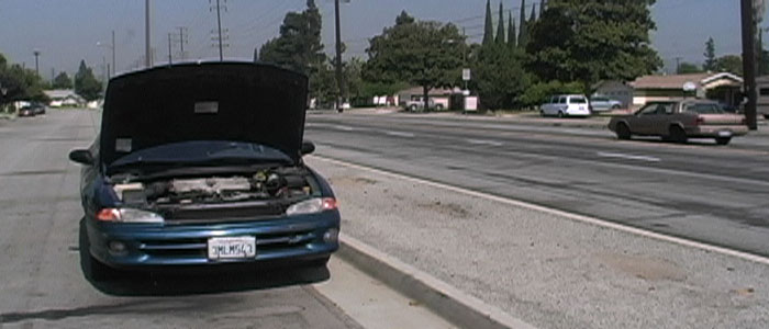
The hood on her car is open. The camera moves out of the internal workings to look down the road. No aid cometh.
...right. Because looking at the image above totally screams: You are alone and abandoned!
Show, don't tell.
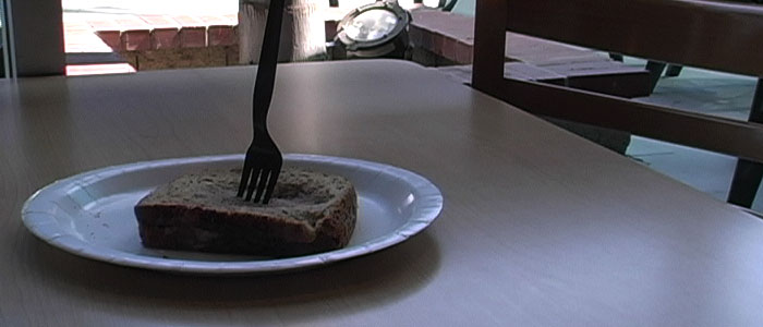
A soggy, half-eaten peanut butter and jelly sandwich sits on the table. A fork is driven into like a dagger.
Not only does the image not convey the message but the message is so vague it's impossible--even reading it--to figure out what I was trying to say.
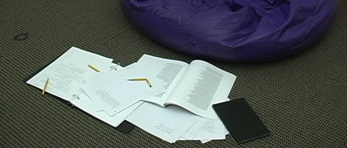
Papers with notes, doodles, and scribbles form a blanket on the ground. The sheer amount is overwhelming. A broken pencil lies in the middle of the mess.
I don't get that vibe from the image. Do you? No.
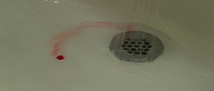
The drip of a faucet. A drop of blood refused to be carried down the drain by the water.
Did she cut herself shaving? Did she have a bloody nose? Did her nail polish drip? And why didn't she wipe it up?
No clue.
After that experience I created a new rule for myself: Describe only what you see. If that does not communicate then you need to come up with something else. So, the first two examples fit with the first half of this rule. But they utterly fail the second half of the rule: They are accurate descriptions but say nothing to the audience.
The last five examples fail both aspects of my script rule completely.
This isn't fool-proof, but it's a good rule to follow if you don't want your script to be lost in translation from text to visual expression: Describe only what you see. If that does not communicate then you need to come up with something else.
~Luke Holzmann
Your Media Production Mentor
2.23.2010
Bare Bones
Unfortunately, in my zeal for speed, my movies tended not to make sense. Rather than a complete body they were a skeleton. You could tell that a story would fit around my elements, but the whole picture was not there.
My senior project--which I shot with my own camera, without lights or a microphone--is a good example of this. I had recently written a 45 page script with 14 speaking parts and realized it was too big. So I wrote a five page script with three words and two characters.
Everyone loved my script.
But just because my prose made perfect sense, my film was little more than bare bones. Thus, the meaning--the story/the heart--was missing. Here are the last 30 seconds of my 3:20 short:
Retexit - the final 30 seconds
There were many other fundamental problems with "Retexit" but I'll cover those at a later time. The point is that you must find a balance when constructing your tales. Too much and your story is buried behind a mountain of useless bits. Too little and your story loses its form and falls apart.
Skeleton or Mountain
~Luke Holzmann
Your Media Production Mentor
2.22.2010
Extra Frames
Awkward Pauses
As an audience we're left waiting for the next thing to happen and we even know what it has to be. At one point one of the characters runs into a bathroom and shuts the door. We wait while the door fully closes. Then we cut inside and there is a slight pause while the actor gets ready to continue running into the bathroom.
It completely ruins the momentum of the film. What's worse, since this was geared to be a comedy piece, the poor pacing killed every single joke.
I suggested that he try cutting at least a second from the beginning and end of every single shot in his film. Since it was 1:12 seconds long with about 20 cuts, I'm guessing his film could easily get down to a smooth 30 seconds. And it would be much, much better.
Remove Extra Frames
Of course, it's possible to go too far the other way... a topic we will explore tomorrow.
~Luke Holzmann
Your Media Production Mentor
2.21.2010
How Commercials Helped TV
There are stations, however, that use a subscription or some other method of raising money that they can forgo advertising. These stations can run a show for the full hour without taking up time to tell us about their sponsors. So instead of a 42 minute show we get something closer to 55 minutes.
And it's horrible.
If you give a television producer 13 full minutes more every hour, they seem incapable of adding more story. Instead, they just toss in stuff we don't need. Giving them almost 25% more time is a waste because they don't know what to do with it. In fact, if anything, the shows I've watched that come out of non-standard-broadcast stations have far less content per episode than my favorite shows that are packed full of wonderful story goodness their entire 42 minute duration.
I think commercials have helped television by forcing filmmakers to stick to their story. Those who do not have that pressure wander because they don't have the self discipline necessary to keep their tale moving forward. They've become lazy.
Next time you edit a piece, try to cut out a forth of it. Then see if you can cut a little more.
I shot a short in college that was originally 6 minutes long.
A week later I cut it down to 4.
After I presented it to my audience I realized it should have been 2.
Using that as a baseline, I think many TV producers need to combine two episodes for every one they current turn out. That means they need to write more too, but that's good for the audience.
And don't forget: Your audience is what matters.
~Luke Holzmann
Your Media Production Mentor
2.20.2010
The Student Film Look: Stuff We Don't Need
This isn't always my fault. Most of the competitions I've entered had a minimum length of at least 3 minutes... which is ridiculous. A 30 second minimum? Sure. But 3 minutes? That's just stupid. Three minutes is way too long in most cases. What's sad, however, is that my companions who participate in these competitions usually push toward to the maximum time limit. No one should need 7 minutes to tell a story they produced in 48 hours.
I'm forced to "pad" my films with needless garbage while others refuse to cut anything out. All of this leads to shorts that are way too long filled with stuff we, as an audience, don't need. It's not just useless shots either. Dialog is a common prey to inexperience.
Mom: How are you feeling, honey?
She walks over to her son bundled up on the couch looking ill. She feels his forehead.
Mom: You're burning up.
Son: Yeah, I don't feel well.
Mom: I'm sorry. Let me get you some water.
Son: Thanks, mom.
Why would this ever be included in a film? It tells us nothing, shows us nothing, demonstrates nothing and does not advance the plot at all. If your point in this scene is that the boy is sick do the following:
Mom hands the boy, bundled up on the couch, a glass of water. He smiles weakly at her.
Done.
The rule they hammered into us in film school was that we were supposed to enter a scene as late as possible and get out again as early as possible. Even so, student films drag on and on with dialog we don't need to tell us stuff we already know.
But I get it. I love the scene where my main characters talk about driving in the left lane on the freeway. Why? Because I wrote the scene because I drive in the left lane on the freeway. It's a peek into my life. It's important to me.
But it's not important to my story and it's really not important to my audience. You, dear blog reader, don't care what lane I prefer on the freeway. And you shouldn't. It doesn't matter at all. And yet that scene remained in one of my scripts through four drafts.
Which is almost as ridiculous as having a minimum time limit of 3 minutes for a short.
Entire scenes could be dropped from your movie. Lines should be replaced with looks. Themes need to be submerged under your story. Shots must be trimmed back.
How can you help your production not have the student film look?
Cut out everything you don't need.
If professionals can tell you an entire life story in 10 minutes--including the intricacies of a relationship--it is a sure sign you're dealing with an amateur when it takes 30 seconds to tell us that someone isn't feeling well. Move beyond telling us stuff and tell us why it matters.
~Luke Holzmann
Your Media Production Mentor
2.19.2010
The Student Film Look: Framing
I'm not a professional DP so I can't tell you what the difference is, but I can see it. Student films contain several shots that make me wince. The framing, while technically perfect, is wrong. I rarely notice such shots in major motion pictures. I wish I could tell you the technicalities of getting a blockbuster shot, but I can't. There's probably a lot of math involved and yet the practical outplay is artistic/feelings based. One shot will feel better than another. One framing setup will look better than the other. And great DPs, I believe, have had enough practice to get it right.
Consider the following two frames:
Framing 1
Framing 2
The framing is very similar, but it's not the same. I lined up the left eye perfectly, so they are technically the same as far as thirds and all that is concerned. So, from a technical standpoint, they are identical. But the quality of the framing is very different.
I like the first one. It's shot from a slightly higher angle (how I see the world from my height), her smile is great, and the leaves make a diagonal line almost directly to her eye. It's a friendly shot.
The second shot, however, is better. She doesn't feel like she's falling off the frame because there's a little more fence. The angle is lower so we feel more connected to her and we can see over the fence in the background; this expands the world in the frame. There's more color contrast all the way around her face. This makes her stand out more. This is a great shot for a movie. It's not as friendly, but it's more comfortable.
How do you get better framing?
Practice.
I learned what shots were best to get after I edited nine hours of footage I'd shot down to a single presentation. Pure experience is the best tutor I can suggest. Trust your eyes, yes; but train them too. Get a friend of yours to go out shooting with you for a few hours. Take hundreds of pictures. Keep snapping while you move around in various locations. Try higher and lower angles. Move slightly to the left and right. Move farther away and then closer. Give yourself a ton of material to drink in later.
And then flip through your pictures.
I've found that if I take 250 shots, I'll find maybe eight that I think are really good.
If that's my shooting ratio, it's little wonder my shots don't line up with the professionals.
~Luke Holzmann
Your Media Production Mentor
2.18.2010
The Student Film Look: Should Major in Photography
It takes a moment, but then--with the subtle cue of traffic sounds--we realize we're looking at a gas pump.
Gas Pump
The shot holds unbearably long. We're seriously looking at a gas pump. The music lilts and falls in the background. Finally, finally, we move on too...
Country Side
A wide-open world of sprawling landscape. Again, the director really wants us to feel his point, his thesis. In this case it's probably something like: Fuel is ruining our lives; or Save the poor farmer from rising prices; or If only we had the little that we needed; or Something like that.
This hodgepodge of loosely related clips continues through the opening titles. And while the assorted clips theme may not resurface until the end credits, the drawn-out shots will be sustained.
Why?
I believe it's because most student DPs should have been photography majors. They focus on the beauty of the shot, the texture of the lighting, the way this shot makes them feel. And they completely forget about telling a story.
Film, for them, is about the visual experience. And they're not alone. There are several popular directors who have a similar bent. The aesthetic experience permeates their films while the story and content fade into the distant background. Freeze frames from their film would have made a better art gallery show than a film.
Why don't the student editors, who tend to be about driving the story forward, fix this then? Why do these long, drawn-out scenes remain?
- Many student/low-budget directors edit their own pieces. They like the shot, so they leave it in.
- Student editors who take on high production value projects with no content can't figure out how to edit the movie. Without a story or action to follow, these fledgling story crafters can't make heads or tails of the footage. So they follow the director's direction and, because the director likes the shot, it stays in.
- Early editors struggle to keep stories moving. Just attend a student film festival... almost every single film will be way too long.
How do you overcome this?
Beautiful/well-crafted shots are an essential part of a good film. But I would recommend following the advice of the creators of Myst: Ask yourself with every shot, "Am I walking through this room, or stopping and staring?"
Your audience members, while they appreciate good aesthetics, are not stopping and staring. They're waiting to be show a story.
~Luke Holzmann
Your Media Production Mentor
2.16.2010
The Student Film Look: Thesis Not Story
Rebecca LuElla Miller
The great films that are also original are even more fun. Each scene reveals an exciting new aspect of the tale.
Not so with student films.
Student films are plagued by the filmmaker's ideas instead of their story. Each scene plays out like a script meeting and you can almost hear them discussing the plot points.
Writer: This whole movie is about not being able to see, and now, the one character that can see is plunged into darkness.
Director: Yeah! And the audience will experience this with her because we'll pan slowly into the darkness and then hear her stumbling around. It'll be great!
Ugh. (Incidentally, Blindness--from which the above was taken--inspired me to start this series.) Rather than being an important part of the story, this scene is part of the film's thesis. It actually does nothing to advance the plot whatsoever. It happens because the filmmaker wants to say something. The scene isn't out of place. We know exactly why it's there. And that's the problem. Rather than going along for the ride, we must wade (and wait) through the director's reiteration of what his movie is about.
Student films are "about something." Great films are well-crafted visual stories that blend the other arts into the experience.
Story, not thesis.
Come to think of it, this is probably one of the major problems with Christian films as well.
How do you grow out of thesis filmmaking? I don't have a great answer because many, many films--even those with big names and big money behind them--get it wrong. I think the first place to start, however, is focus on writing a great story. Don't start with a thesis. Start with a story. And if you need help finding stories to practice on, read a great book for inspiration.
Great stories will have a thesis, to be sure. But the story supports the thesis, not the other way around. Story needs to come first.
~Luke Holzmann
Your Media Production Mentor
2.13.2010
The Student Film Look: Unnecessary Shots
"What?" I looked down at the blue angel candle that sat on the desk. As students, we were using someone's bedroom for our scene. The candle just happened to be part of the room's natural decor. "What does that have to do with this scene?"
Angel Candle
He paused. I could see the wheels turning. He threw out some philosophical justification. I shot it down. He gave me another reason. I countered. Finally, he threw up his hands and said, "Just get the shot. I like it so it's going in the movie."
When we got back to the scene in editing the director said, "I know you hate that shot, Luke. But I like it. So leave it."
If I had been reading this blog back then, I think I would have urged that we replace the few seconds of pointless angel candle with an establishing shot of the house.
Years later, after we had made several other films together, the director sat down next to me on set. "You know that angel candle? I should have listened to you," he said.
Unnecessary shots are a huge problem in student films. They look nice. They're super cool. You paid a ton of money to get them. You're fixated on them. They have the highest production value of your entire flick...
No matter the reason, you must learn to "kill your babies." The vicious nature of great directors has always impressed me. Watching behind the scenes clips and deleted scenes is a great way to see how a director--despite his love or passion for a scene--will axe it when it doesn't belong in his movie.
Next time you're tempted to include a shot that you love, try cutting it out of your movie and ask yourself: Is my story suffering? Is my audience going to miss this shot? If they answer is no, stop being a student filmmaker and join the world of great directors who put the story before their personal preferences.
~Luke Holzmann
Your Media Production Mentor
2.12.2010
The Student Film Look: Establishing Shots
I think I'm beginning to narrow down some of little fixes that, if implemented, would really help your next production look more like a professional piece. And the first would be to use establishing shots.
Low budget productions don't have these. Sprinkling a few one second shots of buildings into your film will improve it's quality tremendously.
The Five Laws of Establishing Shots:
- The image must convey a location--be it a house, a village or a planet
- Recognizable characters must not be in the shot
- It must be short (with no significant camera motion)
- It must have its own sound (but the next scene's audio often starts here)
- One should be included with every major location change
Write them into your index cards and script if you need to. You need these shots. Not that the audience can't figure out that you've moved from the hideout to the space station. That's not the important function of an establishing shot. The establishing shot establishes the location for your next scene. It's a sign post, if you will. It quietly leads your viewers from one location to the next. It's not necessary--which is likely why people on a tight budget and time frame ignore it--but it does expand the production value of your flick.
Next time you're on set, see if you can grab a quick exterior of your location. Or find some stock footage of a similar location. Or find a completely different exterior location that will work to establish the location of whatever you built on your set.
These extra few seconds will improve your production quality far beyond your short focus depth and moody lighting.
~Luke Holzmann
Your Media Production Mentor
Pet Peeve: Lost Worlds
There's just one problem: In a world where you can do anything there is a strong tendency to do everything.
That bothers me.
Fictitious worlds need to have some semblance of consistency. Want to give me an "all powerful Force," I'll buy it. Create a world where skills can be uploaded via image strings? Cool. Spout some nonsense about gravity not affecting you if you just ignore it? Okay.
You can even crash a plane, create a monster, heal a cripple, have an omnipotent character and his timeless mentor, toss a polar bear in the mix--just because, stage a nuclear bomb, whisper in the trees, steal babies, and even jump through time... and I'll give it to you. But there comes a point where your world no longer holds together because, well, you don't bother to keep it together. If, on top of everything else you just tossed my way, I have a sister I didn't know about, you're pushing your limit.
You can have the force and a secret sister. You can give me omnipotence and resurrection. You can have time travel and an unseen enemy. But when you start combining everything and stirring it into one giant pot, I start to lose faith in your sense of direction.
Your world needs to be bound by rules, otherwise it's not a world anymore. It's a smorgasbord stew. And shows about stew--unless they're produced by Alton Brown--are typically lame.
~Luke Holzmann
Your Media Production Mentor
2.10.2010
Further Along in the Story Than You
But then I read an interview with the Chuck co-creators and am more impressed than ever. Give it a read and gain incredible insights into TV production (though the ideas are easily applicable to other forms of media production as well).
I was planning on commenting on some of the finer points, but I'm going to stop talking to give you enough time to read the interview.
Read it here.
I've been very impressed with Alan Sepinwall's coverage of Chuck in general. Very interesting to read his insights after watching an episode.
~Luke Holzmann
Your Media Production Mentor
2.09.2010
Google Got It Right
Parisian Love
The rest of the Super Bowl ads I've seen from this year were a letdown. I mean, at least three ads with dudes in their underwear? No thanks. I sumo one was fun. And the Focus on the Family hoopla seems to have been completely for naught. What was that?
And, I know I've blogged about how I'm not a Megan Fox fan before. Her commercial was lame. She's simply not that attractive and--if you really want to see her--there are far more titillating pictures that a simple google (see above) will quickly provide if one were so inclined. Now, if it were Camilla, maybe I'd believe such an add... <smile>
Every since Weird Al did Auto Tune, I feel like T-Pain is old hat.
Okay, enough with the negative. Go back up and watch the Google commercial again. Pay attention to how they tell the story. Music, sound effects, carefully selected shots. In 30 seconds they demonstrate the power of search as well as translation, auto correct, maps integration, status reports and other Google features. The ending is brilliant because they take you through preparing for the wedding, the ceremony, after the ceremony to your first kid in a second or two. With text. All with the same search.
That is excellent media production.
~Luke Holzmann
Your Media Production Mentor
2.06.2010
The Death of a Show
...or How to Bleed a Story Dry
A Real Drop of My Blood
I just finished buzzing through the first season of Dexter. I won't be watching more. Based on the reviews I've read, I'm in the minority here. But that's okay. I'm used to being in the minority. Remember? I hated The Dark Knight.
Briefly, the reasons I didn't like Dexter much:
- There were four funny lines in the show. But only four. That's one for every three episodes. Which is unacceptable for a "darkly funny" series.
- Dexter has too many feelings for his consistent "I wish I felt something" whining. It was annoying.
- The subplots were uninteresting.
- This was driven by the fact that the characters were lame.
- Which was probably due to the poor acting/writing/directing (not sure which).
- It felt like the editor's were stretching a 42 minute TV edit out to the requisite 55 minutes for Showtime.
- It took 12 hours to tell that simple of a story? Would have made a great short, or perhaps a 90 minute flick.
- I'm used to violence, sex and language in movies. Doesn't bother me. But seeing it "on TV" just felt wrong.
In the end, however, I guess I just didn't like it. While I can try to articulate the technical and artistic shortcomings, the fact that others enjoy the show demonstrates what I've said before: There's an audience for everything.
I simply did not buy the Dexter world. I can suspend disbelief in a hyper-stylized world where brutal violence plays out. I can giggle with the over-the-top comedy that shatters continuity. But if you ask me to believe in a world where people have uncontrollable urges to kill others--especially because they saw their mother brutally murdered--well, I'm sorry. For all of my urges, I always have a choice. To say that I don't is pathetic, juvenile, and not fun at all. It smacks of the child who says, "I need the ice cream cone. I need it!"
No, child, you don't.
Dexter's world is as fake as the blood they pour out in the course of the show. If you enjoy the series, next time you watch the opening titles compare the drop of blood in Dexter's sink to the one above.
If nothing else, you will learn the true splatter pattern of a drop of blood into a sink from three feet up.
~Luke Holzmann
Your Media Production Mentor
Print 3D
First time I saw it was the print Avatar edition of CGW. Made sense: 3D popular flick built in CG.
But Lego?
Lego Magazine 3D
Here we have a 3D toy being advertised in 3D.
Interesting.
Where else will this recent 3D fad take us?
I have no problems believing that 3D will continue to expand. I'm waiting for the day when hard core football fans will be able to watch their favorite bean shaped ball spiral perfectly toward them. The sports fans powered the HD switch. I have no problem believing they will fuel the home 3D option as well.
And their children, happily playing with Legos in front of the TV, will think this is how media has always been.
~Luke Holzmann
Your Media Production Mentor
2.04.2010
Making Errors Make Sense
...which is why, I'm guessing, Apple has switched their error messages to say: The application has unexpectedly quit. I mean, if you're going to merely acknowledge the fact that something went wrong you might as well be as nonchalant as possible.
These inane error messages are usually of little consequence. There's nothing we can really do about it and, other than massive amounts of data loss, there isn't much harm done.
But for web and game designers error messages need to make sense. If something isn't working there is a reason for it and your visitor/player needs to know what they need to do to fix it. Here is an example of what not to do: I've been trying to sign up for a new autopay system for four weeks now. I entered all the data and then was given a vague: We're sorry, something has gone wrong. Please try again later and if it keeps happening, contact customer support.
So I contacted customer support.
Three times.
It wasn't until the third time when I forced the guy to stay on the phone with me while I walked through the steps that I was told: Oh, you have to use both letters and numbers in your username.
Huh? Really?
Oh, and you can't use special characters--like periods--in your account recovery information either.
Huh? Really?
A simple message that said: You must include at least one numeric character in your username would have saved me three calls and four weeks of fiddling.
So, wherever possible, use your error messages to help the end user. Otherwise, as with the messages from your computer, your users will be helpless to move forward.
~Luke Holzmann
Your Media Production Mentor
1.30.2010
When You Forget the Laws of Life
What's Wrong with This Picture?
I realize that it's easier to see the main characters without extras in those seats. I totally understand how hard it is to get the audience to focus on the right thing when Mrs. Big Hair and Mr. Tall are right in front of your stars. I totally get that.
But if you're going to leave those two seats empty, leave a few other seats empty as well. This will do at least three things:
- Make your scene less conspicuously staged
- Save you money on extras
- Not make your editor hate you for doing something stupid on set that he can't "fix in post"
The Lesson: As you look through your veiwfinder or at your monitor, don't just look at color, lighting and aesthetics. Ask yourself: Does this even make sense?
In this scene from Law Abiding Citizen, it's not just the two empty seats. It's the fact that there are so many people listening to a 10 year old play cello. There should be more empty seats and/or less nice suits with some kids.
~Luke Holzmann
Your Media Production Mentor
1.26.2010
Chuckled
Sad times.
So, to brighten things up I'm sharing with you my official Chuck badge:
Licensed Nerd
Get your own badge via the Chuck Me Out iPhone app. Some fun stuff there.
Now if only watching Chuck also improved my coding skill...
~Luke Holzmann
Your Media Production Mentor
1.25.2010
Chrome Extensions
But Chrome is fast. Really fast. Perfect if you just need to look something up really quick or perform a task that--for whatever reason--kills Firefox. In my case, I no longer use Firefox with my RSS reader because it can't handle the hundreds of blogs I follow. So I use Chrome. I also use Chrome when I need to update a website because it seems to handle multiple processes in tabs better.
But Chrome was missing something. It didn't have all those nifty tools that I could tack onto Firefox when I needed a powerhouse packed with resources. Until now...
Chrome Just Got Better
I rarely look at ads on Facebook, but I noticed that Chrome now has Extensions.
Seriously?
Granted, they don't have NoScript yet. But they do have a version of AdBlock. And that is absolutely a step in the right direction. (Of course, if I had ads blocked would I have missed the fact that Chrome can now block ads...?)
Seriously, friends, keep an eye on Chrome. Google seems to be pretty serious about this whole browser/OS thing and this is a very good step forward.
~Luke Holzmann
Your Media Production Mentor
1.21.2010
Attention Spans
Some movies are so bad I even start skipping scenes. I think one two and half hour movie took me three minutes to get through.
I don't suffer boredom well when it's inflicted by people who can't do their job.
On the other hand, I completely disagree with the seemingly common idea that "kids these days" have short attention spans brought on by the evils of MTV's "quick cutting." I don't buy it for a minute.
Why?
Sure, kids aren't going to sit through the forty-five minutes of floating spaceships and classical music in 2001: A Space Odyssey... but why should they? That opening hour is nothing more than Kubrick showing off. He certainly isn't telling a story.
And while we may not have the patience for the slower pace of older movies, we'll happily sit through a Lord of the Rings Extended Edition marathon. We may not want to waste 120 minutes on a movie that, with modern editing and a more advanced film audience, could have been over in under and hour. But we'll happily while away hours upon end in catching up on our latest favorite TV show.
So, no, we've not lost our ability to keep our attention focused for long periods of time. Rather, we're just more astute when it comes to recognizing an older form of storytelling that progresses at a rate fit for an audience that no longer exists. Back in the day, editors believed that for an audience to follow the action every single step must be carried out. We must stop the car, get out, close the door, walk up the steps, open the door, walk in and then--and only then--cut to the party inside.
But no more.
We get it. If you were seen exiting your house in the previous shot, we know you traveled to the party.
The modern audience isn't plagued by short attention deficit disorder. No, we're just more savvy and no longer suffer pointless footage gladly.
~Luke Holzmann
Your Media Production Mentor
1.16.2010
I Hate the Look of Film
And I love how digital looks on the screen: Vibrant, solid, steady, crisp...
But today and I went to see a movie. It was on film. The trailers before the film set me on edge. The jitter. The graininess. The soft-focus. I couldn't enjoy the trailer at all because the "film look" was killing me.
My revulsion hadn't diminished by the start of the flick. The image was bouncing everywhere, but it wasn't intentional. I was struggling to focus on the story because the presentation was reminding me--with every flicker and bounce--that I was watching a movie on film. It was infuriating.
Thankfully, after about ten minutes I was able to tune out the medium and enjoy the tale. But the medium was a distraction at the beginning.
And that is unfortunate.
So, yes: I hate the look of film. Give me digital, please.
~Luke Holzmann
Your Media Production Mentor
1.14.2010
The Potato, Brush and Finger Paint
So what will happen to the mouse? Are computer interfaces going entirely tactile with human contact?
I don't think so.
I'm fairly sure the mouse will remain for quite a while longer. The simplicity, control and options that mice provide are too numerous to give up. Though, when trying to draw it is like using a potato.
Which is why I love my pen tablet. It is precise and fast: Exactly what I want from an interface tool.
But fingers? The results are about as good as finger paint. Fun sometimes and moderately functional, but hardly precise. So while it will continue to be useful on small devices for fun as well as a few "real" tasks, it's not going to take over the home computer world.
But I hope that multi-touch is used to advance the tablet interface. It would be awesome to move beyond the world of the fine point pen and begin to be able to use brushes and textured tools--like sponges--to "paint" on our computers.
~Luke Holzmann
Your Media Production Mentor
1.12.2010
Pet Peeve: Streaming Video
...most of the time.
Dreaded Buffering
Here's the deal, video content delivery people:
I don't mind waiting if, and only if, I can buffer/download the entire thing. If you only give me a few "buffer bars" and no more, you're ruining my viewing experience. If, for whatever reason, my internet is slow or your server is being slashdotted and I can't get my 1080p image to play in real time... you need to let me cache the video, not just buffer.
It does me little good to watch 15 seconds of a show, only to have to wait four minutes for the next 15.
So, please, take a cue from QuickTime and YouTube: Let me get the entire show preloaded if I want.
I know, I know: Doing so will increase the amount of data you have to serve out because people won't get as fed up with your site and abandon you. I realize this. But consider the alternative: You don't have to resubmit the data if they want to rewind and watch a part again.
That's got to be worth something.
Thank you for considering my plea.
~Luke Holzmann
Your Media Production Mentor