4.30.2009
The Pelican Brief...case
Pelican won, hands down.
And they've got a great tagline/guarantee: You break it, we replace it... forever.
And, what was more, the case was a great price too.
So if you're ever looking for a good hard case to lug... whatever around, check them out.
My Pelican Case
Not surprisingly, I don't have many picture of my camera case "in action." I'll need to work on that next time we do a shoot.
~Luke Holzmann
Your Media Production Mentor
4.29.2009
Microsoft IE Errors
I'm much more of a Firefox/Chrome kind of guy.
But for as infuriating and lame as IE is, it is excellent for showing you problems with your site. Granted, many problems are due to IE's problematic rendering of code, so set those issues aside for a moment. The reality is this: Twice in the recent months, I have come across errors on my page that only IE displayed that proved to be at the code level. In other words: There was a problem with my code, and IE was the only browser to tell me.
For instance, the page looked great in Firefox, Chrome, and Safari, but IE had my text getting smaller and smaller at the bottom of one of my pages. Something like:
Small
smaller
smallest
Once I saw the problem in IE, I instantly knew that I had missed a </sup> tag, and was able to fix the problem in no time. But had I stuck with Firefox only, the problem would still exist.
Someone may object and say: But if the other browsers show what you want, who cares if the code is wrong?
Well: 1. Sloppy/wrong code is not good and can lead to bigger issues. 2. What if, in the future, I actually wanted a dual <sup> tag and the browser wouldn't let me? It quickly becomes problematic when your computer/application starts thinking for you.
So remember: As frustrating as it can be, check your site on IE.
You may just find an error that you wouldn't have seen otherwise.
Of course, you may not. There's still something odd with one my blogs in IE, and I have no idea why.
~Luke Holzmann
Your Media Production Mentor
4.28.2009
Editing Online
Jumpcut Closing
This interests me because web-based media is predicted to be huge. There's a bunch of people saying that web delivery will soon outstrip even Blu-ray. More and more image manipulation options are available online, and Flash-based applications are becoming pretty big. This is to say nothing of the many free video hosting sites available. So to see a moderately viable video option go away is interesting.
~Luke Holzmann
Your Media Production Mentor
4.27.2009
A Stone Thrown from a Rock Opera
But I didn't.
First, I thought the concept was interesting, and I'm a all for a good daddy-daughter story (the primary reason I think Taken could be fun). I guess I'm just really ready for my kids to come home.
Second, I thought the visual style was going to be cool. And "Rock Opera"? Come on! That's gotta be sweet.
Then I watched it.
First, the story was choppy with elements slapped together that did nothing for the overall tale; characters that had no business being in the movie, and a plot that hardly held together. It turns out that the movie is based off a musical, which is based off a short musical, which is based off a ten minute concept musical by the same two guys ...no wonder it felt disjointed. Lesson 1: Don't keep tacking on elements to make your movie "full length." If it's a short, make a short.
The father/daughter dynamic was almost touching, but the lame lyrics and jumpy feel knocked most of the emotion out of the picture. And that's really sad because I thought they had made Alexa potentially really cute for the flick:
Alexa
Alexa: Repo
Second, the style was okay, but nothing amazing. I watched in online, so it's hard to really assess how the film looks and feels, but it didn't have the smoothness of 300, nor the grittiness of Sin City. And the "comic book" style was handled much better in Kill Bill: Vol. 1. In fact, it felt more like a rip-off than a sweet new movie.
And the music/singing wasn't good. And the acting was even worse. The way they put together the "music" for Paul Sorvino to "sing" screamed: This guy can't sing, so we're trying to hide that fact! Please don't notice! But then his acting was bad too. So, we had poor music, actors who couldn't sing, and singers who couldn't act. That's just a bad mix. Lesson 2: If you make a musical, get musical people. If you make a movie, get actors. If you make both, get those rare incredible people who could pull it off. I kept thinking, 'They should have gotten Meat Loaf to be the bad guy.'
So, I'm bummed.
To try to salvage this, here's Meat Loaf's rock opera song, complete with vampire set, motorcycles, police, beautiful girls, sexually loaded lyrics, and a story that makes about as much sense as Repo but which is far more satisfying.
Enjoy!
~Luke Holzmann
Your Media Production Mentor
4.25.2009
Gratuitous Rock Monsters
Lessons from Harold Crick - Part IV
Stranger than Fiction has a couple elements that are introduced early in the film but make absolutely no sense.
And then they come back periodically, still without explanation.
Who are these characters? What do they have to do with the film?
By the second time they come around, they start to make sense. But they're still not explained. They are a recurring theme that doesn't make sense... yet.
I remember watching a film when I much younger and the beginning contains a guy looking out over an African sunset and we hear a woman yell, "Henry!"
Huh?
When I saw the beginning a second time--after I had seen the whole film--it finally made sense. But had I not watched the opening again, I'd still be wondering what was up with Harry. That's because that particular moment was more of a "bookend" than a recurring theme. Bookends absolutely have their place, but they need to be a little more significant than a person's name... unless you wanted to use: Stella!
What makes these completely unexplained recurring themes work in Stranger than Fiction is how they are tied to the story as it unfolds. You slowly realize what is going on.
So remember: Your story elements don't have to make sense ...yet.
Just be sure they are clearly linked to your story by the time everything wraps up at the end.
~Luke Holzmann
Your Media Production Mentor
4.22.2009
Lessons from Harold Crick - Part III
I see a lot of Hollywood movies do this, but student films almost never do. You're watching a scene and then you start hearing the audio from the next scene several seconds before you cut to it.
Granted, many young filmmakers discover that cuts feel better if you start the sound for the next scene slightly before you cut, but rarely--if ever--do they use a line of dialog or two before the cut.
It takes skill and very solid pacing, but this kind of audio lead in can be incredibly powerful.
Early in Stranger than Fiction, Harold Crick completely looses it. After tearing his room apart, he sits on his bed and mumbles, "Harold ...distraught" several times to himself. While still looking into his face we hear:
"I'm afraid what you are describing is schizophrenia."
There is a moment.
He blinks.
Cut to new scene. A full six seconds after we started the audio.
Similarly, later in the film, Harold is stuck and doesn't know what to do. He wanders out to a busy street and then we hear a "ding!" and he starts running.
Cut to him pushing his way out of an elevator as the doors slowly open.
This is brilliant. By using the sound from the next scene to give us a "light bulb moment," the filmmakers have cued us to what the next scene will be about. And they did it by totally cheating with sound. Had they not cut to the elevator but left the "ding" in, it would have felt tacked on. As it is, we don't realize the cue cheat because it's part of the narrative that is about to be shown to us.
Audio cues--not to mention the great music in the film--that use sound from the next scene to lead you in give your movie a more polished and professional look and feel. Look for places where you can use sound as a transition into the next scene.
~Luke Holzmann
Your Media Production Mentor
4.21.2009
Lessons from Harold Crick - Part II
Simply put, the message is this: Keep montages moving.
Unlike chick flicks which tend to have many montages, Stranger than Fiction only has a couple... and only one that is truly an extended montage and not just quickly cut moments to help move the narration along.
Harold Crick, for this musical montage, reads a book on a bus. The whole thing. In one sitting. Over the course of two days.
There is nothing particularly interesting about watching a person read.
In fact, it's rather boring.
Much like the swimming videos I cut in college. I shot hours of footage over the season, and cut it down to only the interesting moments. And those turned out to be the starts, the flip turns, and the finish. I also threw in tons of moments of people doing fun stuff. But the actual swimming? Cut it all out.
Same with this montage. We only see Harold turning pages, chatting with people, and funny things happening in and around the bus.
So if you ever have to add a montage, remember: Keep it moving. And to do that most effectively, you will probably cut out all instances of the thing it is you are montage-ing.
~Luke Holzmann
Your Media Production Mentor
4.20.2009
Lessons from Harold Crick - Part I
Today's lesson: Crossing the Line.
In filmmaking theory, you set up your camera and establish a scene. This opening places certain characters on particular sides of the screen.
Establishing Shot
Harold and Ana are now always going to be shown with Harold on the left and Ana on the right. When we go in for close ups, they stay right where they are supposed to be:
Over the Shoulder: Ana
Over the Shoulder: Harold
If you "cross the line" you place the camera on the other side of the room from your establishing shot--thereby shooting from the other side of "the line"--and your characters flip sides, which can be extremely disorienting and annoying to your audience, even if they couldn't tell you what just happened.
Crossing the Line
Now, the editors of 24 assured my class that today's audiences are rather sophisticated and can handle you moving around, assuming you set up the scene properly. And that's mostly true. Even so, crossing the line can really throw a viewer.
But there are several times in Stranger than Fiction where they completely shattered the line. Two instances immediately come to mind: One where Harold is on the bus, and the other where he knocks on a door.
How do they get away with this?
Movement. The characters move from one side of the screen to the other before they cut to the next camera angle. This allows the audience to move with the camera and feel no disquiet from this broken "rule" of film grammar.
So if you find you need to cross the line because of a cramped location or some other reason, be sure to let your actors or camera movement clue the audience in first before you do it.
~Luke Holzmann
Your Media Production Mentor
4.18.2009
Come Up with a Story
After listening to what they'd come up with thus far, I leaned in and asked, "So what do you want your movie to be about?"
This group had spent the previous three hours talking about potential plot lines--a guy is given a hundred dollars, a girl finds someone she'd been looking for, two cows tell jokes, a guy does odd jobs, a crazy lady hands out odds and ends that have secret meanings--but had yet to give me an actual story.
"If you want your movie to be about the value of life and friendship, then do your movies about $100. If you want your movie to be about the importance of persistence, do the flick about the girl," I said. "But first you have to figure out which story you want to tell. The other elements are easy, after that. The hard part is figuring out which story you want to tell."
It is really hard to come up with a good story. And, for as cool and with it as Apple's gadgets make you look, they aren't going to help you become more creative. They may be "intuitive" and have some really snappy features--which ultimately allow you to create faster--but they do not make you creative. And this plagues Hollywood too. Look no further than Apple Trailers to be reminded of how often media producers have to really reach for an idea.
But enough with the downer message. There is hope!
My brother-in-law pointed me to Best Ads on TV.
Here are people who have come up with and told creative and compelling stories. And their movies don't tend to drag on for five minutes. Often, they tell a tale in 30 seconds.
That's good filmmaking when it comes to shorts.
So stop trying to make a feature.
Stop writing ten minute films.
Don't even sign up for a three minute festival.
Instead, try to shoot a few thirty second commercials that tell a story.
Then start thinking about making longer films. Because before you start making movies, you need to come up with a story.
~Luke Holzmann
Your Media Production Mentor
4.17.2009
The Photo Shoot
She was kind enough to let me.
I snapped hundreds of pictures, and ended up with a handful I really like. And since I have a digital camera, that's exactly what I should be doing. My hope is that as I take more and more pictures, I will discover what I like, what works, and what is just plain awful.
That's the best way to learn: To do it.
I used to film everything, hoping to catch "the right moment." After several years of shooting everything and cutting out the footage that wasn't any good, I learned what good footage looked like and what was useful. The same is true, I'm sure, of photography.
The more you look through the photos you take--and as you delete the ones that are no good--the more familiar you will become with what kinds of framing you like and what you don't.
So snap away! The shutter bug is a good thing... especially now that we have digital cameras that let us take hundreds of photos at a time without any processing fees.
For your inspiration, here's four shots I really liked from today:
Lyndsey 1
Lyndsey 2
Lyndsey 3
Lyndsey 4
Four shots I really like out of all the pictures I took. That's almost a ratio of 100:1. So remember: Keep snapping!
~Luke Holzmann
Your Media Production Mentor
4.15.2009
3 Steps to Getting Smooth Shots
Here are three tricks to get more fluid shots when you're not using a tripod:
1. Don't zoom. For the first several months of shooting (and perhaps for your entire filmmaking career) forget that you have a zoom button. Pull the zoom as far out as possible, and never touch it again.
By zooming in, you basically turn your zoom length into a lever and any little motion is amplified tremendously. And if Archimedes could move the earth with a lever, you'd better believe your shot is going to move if you turn your camera into one. It's much better just to move closer to your subject.
Don't Zoom: The Lever Effect
2. Hug your camera. I know you love your camera, so don't keep it at arm's length. Rather, keep it near your body, and prop your elbow against your side. Much like the lesson in levers from point 1, keeping your camera close--and letting your body absorb some of the shaking--will dramatically improve your shots.
Hug Your Camera: The Human Steady Cam
3. Roll with it. If you've been in marching band, you know how to do this. You want to take small, even steps, starting with your heal and rolling onto the ball of your foot. Heal to toe. Nice and easy.
Don't tip-toe with your camera. That's like walking on stilts and trying to get a nice smooth shot.
Roll with It: Heal to Toe
Bonus: Use a tripod. I know they can be annoying, but it's probably a good idea to slow down your shooting and think about your shots a tad more anyway. Re-setting up your tripod for each shot can keep you thinking about how to get a better picture than merely wandering around with your camera.
So there you have it: 3 tips to getting smoother shots. And you got a quick practical application for your physics course at the same time.
You're welcome.
~Luke Holzmann
Your Media Production Mentor
4.14.2009
Hotmail
A Decade with Hotmail
That's cool and fun. I like it when companies recognize my existence and thank me for my connection to them. And, honestly, Hotmail has been doing at lot of things right lately: They've given me more email space, a faster interface, and a SkyDrive with 25GB.
But the day after they sent me a note of thanks, I tried to log into Hotmail and was greeted with:
You Don't Have an Inbox
'That's odd.' I figured it was because they were changing something and it was just a glitch, but it was still unnerving to log in and no longer have an inbox I'd used for almost half my life. In fact, when I first head about Hotmail, I was incredulous: No one would give away email space for free. We were paying for the internet by the hour back then, so something free had to have a catch.
These days, Gmail reigns supreme.
But despite my love for Gmail, I'm very happy that Microsoft discovered that I did, indeed, have an Inbox in Hotmail a few days later.
Here's to growing old with technology!
~Luke Holzmann
Your Media Production Mentor
4.13.2009
IsoBuster
I'm a huge fan of useful free stuff.
But sometimes--more often than I would like--you actually have to shell out money for a program. And today was one of those days.
Someone had sent me a mini DVD from one of those newfangled "mini DVD camcorder" thingies with really important footage on it. Now, I've cautioned against buying these cameras for a long time--ever since they started coming out, actually--and today I experienced another reason to stay away from them: If you forget to "finalize" the disk, it becomes almost impossible to read. In short, the super easy, straight from camera to DVD player option becomes a massive headache.
I could see data on the bottom of the disk, but all of my computers thought it was blank (Tiger, Vista, XP).
Disk with Data
I got one free program to see that there was some data there, but it couldn't do anything more than report that 244MB were used.
After looking around and reading some reviews, IsoBuster looked like our only hope. And downloading the program proved that it could see the file and claimed to be able to extract it if we would only pay the $30 registration fee.
I bit the bullet and paid.
Ten minutes later I was playing the footage on my desktop and converting it for easier playback.
If you are ever faced with an improperly burned disk and need the footage, IsoBuster may be just the tool you need. And, really, your time is valuable so $30 is likely totally worth it.
~Luke Holzmann
Your Media Production Mentor
4.09.2009
Movie Files
Hey Luke,
We're trying to post a Windows Movie Maker file, and the site says that .wmv, .mov, .avi, and .mpeg files will work.
The video doesn't have a file like that, it just says "Windows Movie Maker."
Do you know how to make a Windows Movie Maker file into one of the supported files?
The file was likely a .MSWMM file--which seems to mean "Microsoft Windows Movie Maker." That means that it's a project file, and not a movie. And there's a big difference between a project file and an actual media file.
A project file is basically a fancy spreadsheet that says, "At this moment, play this clip. At this moment, show this picture. From here to there, play this song" ...and on and on it goes. So a project file doesn't actually have any media in it... which is why project files are relatively small.
A media file contains all the information needed for a computer to play back your media. These are much bigger.
So, if you want to share your media with someone else, you need to make sure you have a media file and not just a project file.
This kind of mistake is actually quite common. For example, I've had people hand me an .html document for a website they were designing on their home computer and were shocked that I couldn't look at it for them. "It works on my computer," they insist.
Yes, but my computer doesn't have all the media files you were linking to on your hard drive. A related mistake is when people post a link to a file on their hard drive: c:\user\luke\documents\My Scrip.rtf. Since it's on your hard drive, I can't look at it. It needs to be online.
If you make this mistake, it's not a big deal. Sending a project file instead of a media is much like sending an email and forgetting the attachment. You're telling someone that the media is there... you're just not giving it to them.
~Luke Holzmann
Your Media Production Mentor
4.08.2009
1am
I finally got done with that part at 1am.
This evening I've installed Photoshop and Final Cut, and am working on the updates for the machine.
This is not a quick process.
~Luke Holzmann
Your Media Production Mentor
4.07.2009
Reinstall
To make that complete, I'm going to wipe my computer's system drive and reinstall everything. I've backed up my data, and hopefully it all goes well.
If not, you may hear about it here.
~Luke Holzmann
Your Media Production Mentor
4.06.2009
Tutorial: Convert to .mp4
Well, Apple has their tutorial. And that's nice.
But there's another way.
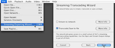
First, download VLC (it's a great media player, free, and cross-platform).
Second, in VLC go to File -> Streaming/Exporting Wizard... and choose Transcode/Save to file:
Export to File
Check both the Video and Audio boxes, and choose the MPEG-4 formats for both. You have to select MP4 in the next step as well:
MPEG-4
Choose where you want to save the file and name it, and press Next:
Save
VLC will do it's magic, and now the video should be ready to go onto your portable media player.
Granted, I don't have one of these newfangled devices so I can't test this. And depending on your player, it may require specific video sizes. But if you need to convert a video into .mp4 format, this is how you do it.
~Luke Holzmann
Your Media Production Mentor
4.04.2009
Portal's Poor Parting Part
But there's much more to the game. Much more. Things like: dropping robots through portals onto the heads of other robots that are trying to kill you, throwing yourself off a cliff and into a portal so the inertia will carry you over the deadly slime, and, of course, cake... which is a lie (or so you surmise).
I really enjoyed the puzzles--overall.
But the last level, the final boss, the end?
Horrible. Hated it. And here's why:
- It's not about solving puzzles. Every other level requires you to figure out how to use the portals and other objects to accomplish your goal.
- There are no visual cues. Every other level has subtle markings that help you know what to do where.
- There's a time requirement. Every other level allows you to think, experiment, and feel your way toward the solution.
- You have to fall close enough to grab something. No other level has anything like this and, given the above, this isn't good.
In short, the final level of Portal is nothing like the rest of the game.
The lesson is this: If you make a game, make it consistent. Inconsistent worlds and game play are exceedingly frustrating for the players.
And I hate timed events.
That is all.
~Luke Holzmann
Your Media Production Mentor
P.S. Portal is not a child's game. It is very dark thematically.
4.03.2009
Audio Recording Interface Box
Sure, if your have a USB or 1/8" microphone, you can plug it into the audio in port on your computer, but the results aren't great. And if you have an XLR or 1/4" device... you're kinda at a loss. No can do.
The first box I got was a Tascam US-122. It was $170 and got the job done, but only lasted a couple years before it just stopped working.
So I was in the market for another audio interface box, preferably under $100 this time. After a lot of searching, I finally found the M-Audio Podcast Factory. I got it refurbished for about $80. It works fairly well and allows me to connect guitars and microphones to my computer. Which is what I need it to do.
And right now, you can purchase one for $40.
If you've been looking for a way to record your guitar, or vocals, or lay down some tracks of your band, this may be the time to start working on your DAW. Granted, you get what you pay for, and the software this comes with is not what you want to use. But if you just need an audio recording interface for your computer, the entry price is really low at the moment.
~Luke Holzmann
Your Media Production Mentor
4.02.2009
Yvette Mimieux
And as I watch movies from years gone by, I find they light the actresses really well. The girls tend to have a catchlight in their eye and just look great.
In fact, I like Ingrid Bergman and Grace Kelly a lot more than, say, Megan Fox or Keira Knightley. And Time Machine has Yvette Mimieux.
Since I'm always bummed when I can't find good pictures of actresses from old films, here are a few screen grabs. I think she plays the part of Weena very well:
Yvette Mimieux in Time Machine
What is it about the actresses in old films? Is it the lighting? The soft film quality? The studio look? Did girls just look better back then?
I really don't know what it is.
But there is something about filmmaking of the past that is different from today. And it's not just that we no longer frame people in the middle of the picture.
~Luke Holzmann
Your Media Production Mentor
4.01.2009
Hacking Blogger with Add-ons
Period.
Here's a little demonstration of this fact.
The things that make Firefox so powerful are the Add-ons. And if you do any kind of web development, you need to get Web Developer (in addition to the givens of NoScript and Adblock Plus). Web Developer does two things I'm going to talk about here:
1. It lets you see what elements are being changed by what code. By pressing Control (Command on a Mac) and Shift and Y, you can move your cursor over an element of a web page and see the CSS that modifies it. For instance, this little text block generated the following information:
#readerpublishermodule0
Armed with that knowledge, I can click the little CSS drop down box, and...
2. Edit the web page on the fly to test out changes, and then paste the code into my web site when I have it working how I want.
So very cool.
But after fiddling with one of my blogs today, I couldn't get the code to work. If I made the changes I wanted, it changed every DIV instead of just the one I was working in. I stared at my code, but I couldn't see my problem.
#readerpublishermodule0 .s a,a:hover {
color: #777;
text-decoration: none;
}
This code is telling the site that for everything within the "readerpublishermodule0" DIV and the "s" section within that, the links should be gray and not underlined both normally and when you hover over them. And this worked great... but it was breaking all my other links as well so the rest of them were the same way (which I didn't want).
I finally got one of my coding buddies to look at it for me, and he pointed out that I couldn't just separate the elements with a comma (like I had with the "a,a:hover") because the comma reset the whole thing back to the global website level... that's why all my links were wrong now.
By simply updated the code like this:
#readerpublishermodule0 .s a,#readerpublishermodule0 .s a:hover {
I was able to get everything working correctly.
And that is how the Web Developer Add-on for Firefox helped me hack my Blogger blog... with the help of someone who knows much more about code than I do <smile>.
~Luke Holzmann
Your Media Production Mentor