10.29.2012
10.27.2012
Reminder for VFX Noobs from Prometheus
As I watched the MPC Prometheus VFX breakdown video, I was reminded of one simple fact: Visual effects is often all about layering.
In fact, the more you "mess up" your image, the better it will look. Concerned your 3D model texture isn't going to hold up? Add lens flare, dust, and heat distortion. I've mentioned before how animators added blemishes to Aki Ross's skin in Final Fantasy. You can't have things look perfect; perfect things don't look real.
[Aside: So, why do we photoshop girls? There must be a balance between perfection and purity.]
Keep in mind that you'll go over your effects shots again and again. Your initial wire frame will look very different in your final render. The trick is to learn how to imagine what it will look like and gain the technical skills to get there.
I'm a total SFX noob myself, so it's nice to be reminded that these guys just have more practice and better equipment than I do. With time and tools, I could do something pretty cool as well. If you're interested in visual effects, start practicing now. There are many free tools out there to use as you get started!
~Luke Holzmann
Your Media Production Mentor
10.20.2012
Your Script Should Tell Stories
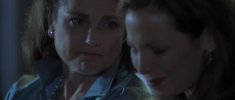
Mother and daughter sit on the porch swing. The girl has obviously been having a rough time recently and her mother has figured out why. There is a moment while the older woman gathers her thoughts. Then...
"Sweetheart. I will never forget when you were in the fifth grade and you were so excited when you got the lead in the play. Do you remember that?"
Kissing Jessica Stein
When we're writing a script it can be easy to forget that we're here to tell stories. We rightly think our movie's plot is the story, and we try to keep that moving forward by simply getting to the point. "Honey, you're a perfectionist and you've missed out on stuff because of it. Stop paralyzing yourself and pursue your dream."
First, such a speech wouldn't really help anyone. Most people know they have a problem but haven't been able to see a way around it. Telling them to "stop it" isn't going to solve anything.
Second, your audience should already know such information. Whatever's happening here is part of your overall story, and you'd better have shown your audience this reality already. Do not use exposition to try to cram your movie into a few sentences... if you do that, you might as well skip making your movie because you already said what you wanted to say.
Instead, use this time to have your characters tell a story. A story from their lives or the lives of others. This is new information for the audience and is something your characters can draw meaning from. In this case, Jessica is able to see that by dropping out of the play because it wasn't going to be "perfect," she ended up missing out on something that could have been wonderful. She also learns that her mother sticks by her side, even after self-destructive choices.
The reality is that stories, not lectures, draw us in and teach us things.
Use stories in your story to better tell your story.
One last tip: If you don't have strong actors like Tovah Feldshuh to carry your scene, you still have options. While your actor tells the story, show it unfold. So, here, get some shots from a youth play practice. Even without world class actors, you can tell a great story inside your main plot.
~Luke Holzmann
Your Media Production Mentor
10.19.2012
10.17.2012
Congratulations Quickfoo!
I am pleased to announce that Quickfoo has become the first person to complete the Production-Now.com Filmmaking 101 course!
One of my Quickfoo favorites is:
Doritos commercial (Re: project 29: selling out)
I'm very impressed with what Quickfoo has created and how much he has improved. He mentioned he just got a new camera, so be sure to Subscribe to his channel to keep up to date with his productions.
~Luke Holzmann
Your Media Production Mentor
10.12.2012
Why Movie Posters Lie
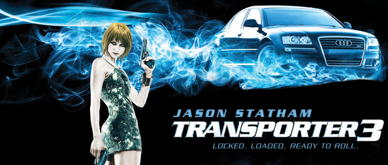
The DVD for Transporter 3 has a girl on the cover wearing a dress not in the movie and carrying two guns, which also never happens.
Transporter 3
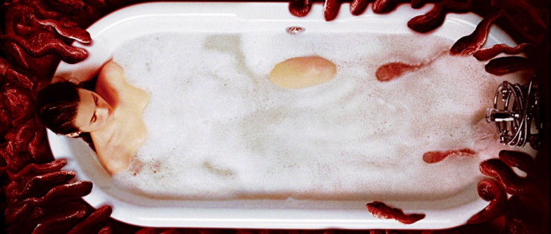
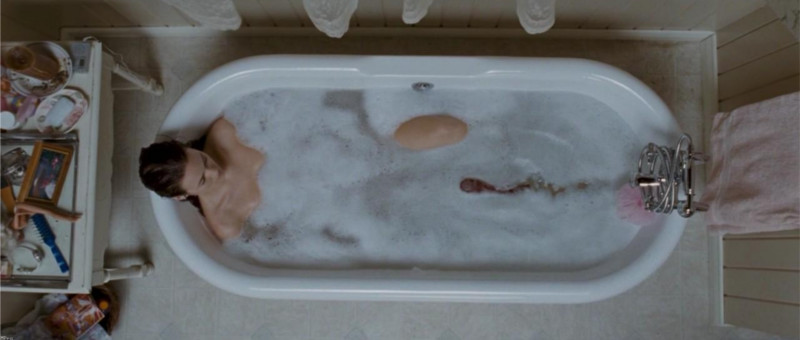
I'm not big on horror flicks--even the comedic kind--but there is a similar disconnect with the poster for Slither. In the marketing materials, we see a girl in the tub descended upon by alien slugs. How the scene plays out is quite different:
Slither
Single Slug
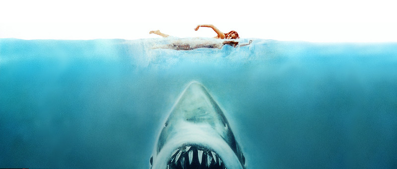
I was surprised by how much I'd been led astray by the marketing materials for this campy horror flick. I shouldn't have been. We've been "lied" to for years. Consider the movie poster for Jaws:
Jaws Poster
In the film, we don't see the shark here and she's floating (not swimming) at night when attacked.
So why "lie" to us? Because movie posters and DVD jackets and trailers are all designed to give you a feel for what you're about to watch. It doesn't really matter if what we are shown is exactly what happens in the flick. Indeed, it's often better to be told what the film is about--and be shown something not in the film--than to be given a snapshot from the movie that doesn't communicate. Put another way:
Communication trumps reality.
This can be disappointing, however, when the part you're most looking forward to in a film is cut. Like the line from the Live Free or Die Hard trailer:
"What are you going to do?"
"I'm going to kill this guy and get my daughter. Or go get my daughter and kill this guy. Or kill all of 'em."
~Luke Holzmann
Your Media Production Mentor
10.11.2012
Image Inspiration: Face and Shadows
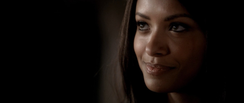
Kat Graham
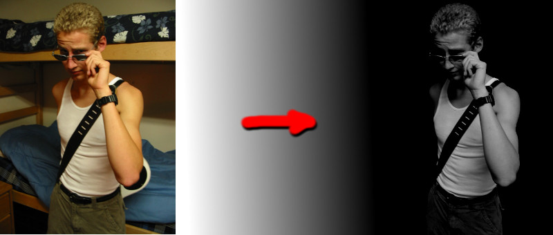
Color "grading" is the process of making your image look awesome. In this case, the light plunges gracefully into shadow. But something tells me they actually masked to black on the left side of the frame. There's nothing wrong with using all the tools in your toolkit to make an image more beautiful.
You know, like taking a snap from your college dorm and turning it into something awesome...
Yes, please.
~Luke Holzmann
Your Media Production Mentor
10.06.2012
The Purpose of a Voice Over
The purpose of narration is to add depth to your world, not tell your audience what's happening.
So many films get this wrong. Rather than open a story visually (the way Up and Sucker Punch do), they have someone explain what's going on... even when it's unnecessary (as they do in the opening of Snow White). Thankfully, Rian Johnson knows how to write. He has the perfect blend of Voice Over (VO) and visual story telling at the beginning of Looper. We can see exactly what's going on, but we don't know why. To help explain this, our narrator sheds light on the world we have been ushered into.
Let me give you an example:
Snow White: We've just seen the queen ill and now she's dead. Cut to a shot of the king grieving and we are told, "The king was inconsolable."
Looper: We see a person suddenly appear on a tarp and get blown away by a guy with a gun. "Time travel will be invented and immediately outlawed..."
In the first example, we already know the king is sad. Telling us this in VO doesn't help us at all. Indeed, the majority of the narration for Snow White is completely pointless. In the second, we now know how these people warp into place and why. We come to understand the intricacies of the world we are shown.
In film, show, don't tell. If it's something that can't be communicated by showing--like someone's reasoning or a ton of history--put the outcome of that idea on the screen (executioners in the past who knock off people from the future) and tell us about why. Do not give us a voice over about something you should have put on the screen.
~Luke Holzmann
Your Media Production Mentor
10.03.2012
Why Snow White Wasn't Charming
There are several lessons to be gleaned from Snow White and the Huntsman. Three of my friends warned me away from the flick because it was "the worst movie they'd ever seen." I'm pretty sure that was more group-think than fact, but I skipped the theater anyway. One of my other friends had picked up the DVD and graciously lent it to me. She conceded that the film was flawed but that, other than Kristen Stewart, there were many redeeming elements. So what do I think?
1. A bad lead will kill your film. I realize that you and I are beggars so we can't be choosers, but keep this in mind: Even if you have the hots for someone, don't cast them if they aren't going to kick your movie up a notch. Stewart was amazing...ly... deadpan. I have created a graphic to illustrate:
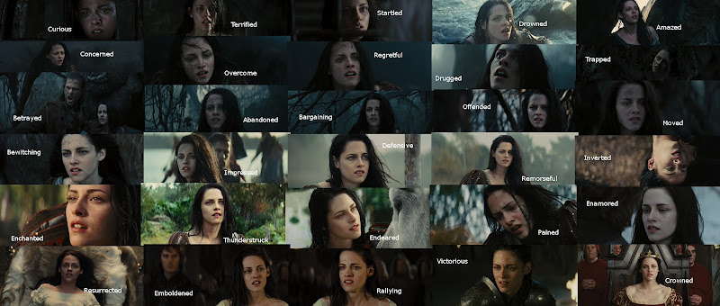
The Many Faces of Kristen Stewart (click for larger version)
But we knew this already. Her's was the first face to make me wish the antagonist won when I saw the trailer all those many moons ago. Charlize is just that much more talented and compelling.
Do not let your personal feelings about an actor get in the way of telling your story.
2. Combine redundant characters. The Huntsman is pining for his lost love, can kick butt, and seeks to take care of Snow White. William has been pining for his lost love, can kick butt, and seeks to take care of Snow White. Ummm... make them one character!
I get it: Kristen's always up for a love triangle. But that's not what we have in this movie. In the end, neither boy is with her and we never see any of them connect. Plus, the idea of pure Snow White falling for two boys is out of character. She likes birds, not boys.
Girls like stories where they have to (get to?) choose between two boys. Typically this is the choice between the bad boy and the best friend. In Snow White's case it's the choice between the dude she just met and the guy she knew once a long time ago. ...again, the similarities are painful.
Even if your source material contains two characters, and you really like possibilities of playing them off each other, do yourself a favor and combine as many characters as possible. This is the role of adaptation. Your story will be much better for it.
3. Having a visual for your story is not visual storytelling. In the behind the scenes, there was lots of talk about storyboards and having a strong visual sense. Of course, if you watch Rupert's commercials and art pieces, you'll notice that a few the visuals from the film were borrowed from his other projects [NB: The video linked contains partial nudity... meaning, you don't see "anything" but there is a lot of naked skin].
Snow White has some really sweet images. But they have little to do with the story. Indeed, I'm willing to bet that the director even had some ideas as to what was going on when he filmed these scenes, but he failed to communicate why they were there. I've made much the same mistake ...as a film student. His producers and editors should have caught this and fixed it before releasing the movie.
Visual storytelling is the art of using images to convey your meaning. Snow White failed to do this over and over again. In fact, in the opening minutes when he actually had some visuals to tell his story (and actors strong enough to pull it off), he ruined it by slapping together a voice over from a character we won't meet for another 40 minutes and who does not, I might add, return to sum things up at the end.
I've recently written several posts that give examples of telling your story through moving pictures: using a visual vice, giving someone humanity, and gaining your audience's trust.
The end of the movie left us hanging. Not only did Kristen look no more interested in her coronation than she did, say, dying, but her two "love interests" were hardly there, and we were left with nothing at the end except a branch with blossoms on it that someone had hacked off a tree and left for Snow White to pick up. A symbol of life returning? Then why cut it off the tree? Why not zoom out of the throne room and past a blooming tree, a la Return of the King?
Please, as you work on your next script, remember to use your pictures to tell your story. Fight against the urge to have a narrator.
What was good? The costumes, some of the effects, and the reminder that you--even without fancy effects or big name actors--can make a better movie.
Now get to it!
~Luke Holzmann
Your Media Production Mentor
Subscribe to:
Posts
(
Atom
)