Production-Now.com Media Production Mentoring

Free online film school designed with beginning filmmakers in mind.

3.18.2010

The Creation of an Animation - Step 1

Storyboards

It all starts with story. And while writing out a story in script format can be helpful, sometimes it's just too much of a hassle to try to translate it into words and scenes and such.

That's why when I'm about to produce a short, I often print off a couple pages of my handy blank storyboards and start sketching. It's often much easier to convey the gist of my story with pictures. This also helps me think through how the visuals and voice over will interact. I can demonstrate sound effects, camera motion, even expressions faster and easier in this format than in a script.

And here's the beautiful thing: You don't have to be an artist. I'm a stick-figure-drawer kind of guy, and my storyboards totally work:
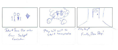

Frames from My Most Recent Storyboard

All it has to do is communicate. It'd be nice to be Rembrandt if you were trying to create static art. But you're not. You're trying to make a short and the faster you can toss together your pieces the better.

So, get to it!

 ~Luke Holzmann
Your Media Production Mentor

3.09.2010

Chuck Training - Part 5

By the by:

I got my screen captures for this series from the ChuckTV.net Gallery. Very nice of them to provide screen captures from every moment of every show. Makes my job easier since the DVD isn't out yet.

 ~Luke Holzmann
Your Media Production Mentor

Chuck Training - Part 4

Audio Bits


Chuck Opening

I'm not a sound guy. In fact, I'm really bad at sound. Simple cutting? Sure. A few added effects when needed? Okay. A little cheesy looped music? I'll try.

But mixing and fixing just ain't my scene.

I took a one-day audio workshop in college. We were given a CD full of sounds, a 30 second clip and two weeks to edit it together.

Two weeks.

About eight days in, a friend of mine approached me. "How's the project going?"

I shrugged. "I threw something together."

"Oh man," he said. "This thing has me so stressed out. I've already put in about 80 hours. I'm going to try to get in a few more before it's due. I just can't get it quite right."

80 hours? It's a 30 second clip. I didn't care if the majority of my grade depended on this thing, it didn't warrant that kind of time. But while my friend was over-ambitious and so paranoid he'd never be hire-able if he kept up that kind of over-thinking, he made an impression on me that day. If you're really into audio, it can become your life.

So watch the above clip again and try to list the sounds they added in addition to the catchy tune.

  • Noise Maker Clicking
  • Metallic hit
  • Woosh
  • Bullets
  • Zoom Whoosh
  • Pop
  • Move Woosh
  • Slide Woosh
  • Breath
  • Turn Woosh
  • Gun Shot
  • Zing
  • Cardboard Hit
  • Car
  • Another Zing
  • Squealing Tires
  • Car Revving
  • More Tires Squealing
  • Ping Pinks Down the Stairs
  • Zoomp
  • Helicopter
  • Bink
  • Blink
  • "He-nt!" (throw)
  • Whoosh of Shurikens
  • Mew
  • Another Woosh
  • Zip
  • Slow Woosh
  • Clicking of Keys

Approximately one "extra" sound bit every second.

That's crazy. While I doubt it took 80 hours, it had to take time to figure out what kind of sound they wanted, find the right sound in their library (or record it), place it in the timeline and then mix it down.

That's 30 seconds of audio for a quick animation piece.

The world of sound blows my mind. But the more attention to detail--and the more layers to add in--the higher your production value.

Just don't take 80 hours to do it or your project will never get done.

 ~Luke Holzmann
Your Media Production Mentor

3.06.2010

Chuck Training - Part 3

The Fool Who Sees Clearly

Allan Sepinwall commented that if Jeff could see clearly enough that Chuck and Sarah need to get together, he expects them to do so soon.

Which would be a good thing.


Jeff, playing the fool

Jeff is a fantastic character. He is Chuck's Shakespearian fool: The only one who can safely speak the truth for the audience without giving away anything to his fellow characters.

This is definitely an element to keep in mind for your productions. Not only does "the Fool" have a long literary history as a character, but he is a great tool for communicating something to your audience when your other characters can't/won't admit it.

 ~Luke Holzmann
Your Media Production Mentor

3.05.2010

Chuck Training - Part 2

Out of Character

I feel like I know Chuck. He's a buddy of mine by now. He's a good guy who, despite his passionate longing for his "it's complicated" for three years, still hasn't slept with her... for numerous complicated reasons.

Chuck is not a player. He doesn't sleep around. He's a good and decent--albeit "modern"--guy who I'm waiting to see in bed with his true love. This is television, after all.

Over the last couple years, I know Chuck really likes girls but he doesn't go out and try to score any points. Instead, he's rather awkward and none too rushed with the whole intercourse thing. So when I see a girl come out of his bathroom in the morning, I immediately think, 'So what's the story? Did her car breakdown and he was nice enough to invite her in?'


Hannah, recently showered

Chuck and Hannah like each other. We've peeked in on them making out. She's a cute girl. But the idea that Chuck and Hannah are sleeping together is a little far-fetched. My mind just won't jump there. But as the show moves along with no mention of why Hannah was in Chuck's shower, the sinking feeling builds. I like Hannah, but I don't want Chuck sleeping with her. That's just lame. And it's completely out of character for Chuck.

It's so out of character the writer of this episode felt the need to include a line of dialog:


"We slept together last night..."

This is disappointing on several levels:

  1. Story: We don't want Chuck sleeping with anyone but Sarah.
  2. Writing: You shouldn't have to tell us something that important. That should be obvious.
  3. Character: This goes against who Chuck is. I can understand a few of the story elements they were trying to push with this, but it was the weakest element of this episode.

It doesn't happen often, but it's sad when I feel like I know a character better than the writer. So as you write, think about who your audience knows your character to be.

 ~Luke Holzmann
Your Media Production Mentor

3.04.2010

Chuck Training - Part 1

Framing

You know that I really enjoy Chuck. But as I watched him take on a fake name, I noticed several things that I felt I needed to point out. Half of the elements in the show were awesome. But some of them were rather terrible.

The first thing I noticed was the poor framing in an early scene. Granted, they were shooting in a hall so space was limited. I understand that. But still...


Ellie is far too close to center. The shot feels a little low. She's also a little close to the audience.


Chuck is also a little too close to center.

Perhaps it's also the relationship between these two angles. One is almost straight on and down a little, the other is off to the side. So rather than talking to each other, it's almost as if they're in two different conversations. I don't know. I'm still trying to figure out what it is that makes these shots less than the typically stellar frames.

Honestly, these two shots don't look bad. But they were startling in the context of the show. When you've got really good framing and then a few shots that are just a little awkward, it's really jarring. Like the suddenly poor sound quality toward the end of the show when we were outside along a busy street. I understand the complexity of shooting next to a road and how audio in such conditions is a nightmare. But while I expect it from student films, it's super noticeable in a major--typically awesome--production.

These elements--as well as others I hope to address soon--combined to make the entire show feel rushed and hacked together. From an audience standpoint, where we had a few weeks off for the Olympics, that felt even more odd.

 ~Luke Holzmann
Your Media Production Mentor

3.02.2010

Effect Shot in the Making

Yesterday I talked about the Two Rules of Special Effects. Today I'm going to give you a real-world example from a production I'm planning on doing in the next couple months.

I need a shot of the roof of an office building collapsing in on the camera. I've never done something like that before, so I decided to do a quick test shot.


Collapsing Roof Test Shot

A little camera shake at the start to simulate the camera being dropped. Some debris falling on top of the camera (crumpled paper and a pizza box).

Pretty cool.

Perhaps not the most impressive implosion of a building you've ever seen, but for an effect that took me a minute to shoot with materials I had on hand... not bad. It communicates the idea.

Rule #1: Check. The shot communicates.

But did anything bother you?

How about the fingers in a few of the frames?


Fingers

I did a quick garbage matte to cover up the really obvious hand-in-shot moments, but the few frames with fingers weren't worth the time.

Did you notice the cross-fade?

I used two different shots. The first where the pizza box falls in front of the camera for a nice look. The second where the box actually covers the lens for a great "fade to black" opportunity. To make it work, I also had to black out half the frame...


Cross-Fade

I'm going to guess that, like my wife, you didn't notice the fingers or the cross-fade.

So Rule #2: Check. The effect does not distract.

 ~Luke Holzmann
Your Media Production Mentor